Component Voting
Vote on what components you'd like to see added to our roadmap in May*
*New components are released on the first Monday of each month. The top voted item on the voting board will be added to our roadmap for future monthly releases. All votes will be reset for each month to keep requests more relevant.
You must be logged in to vote.

More Off-Grid Components
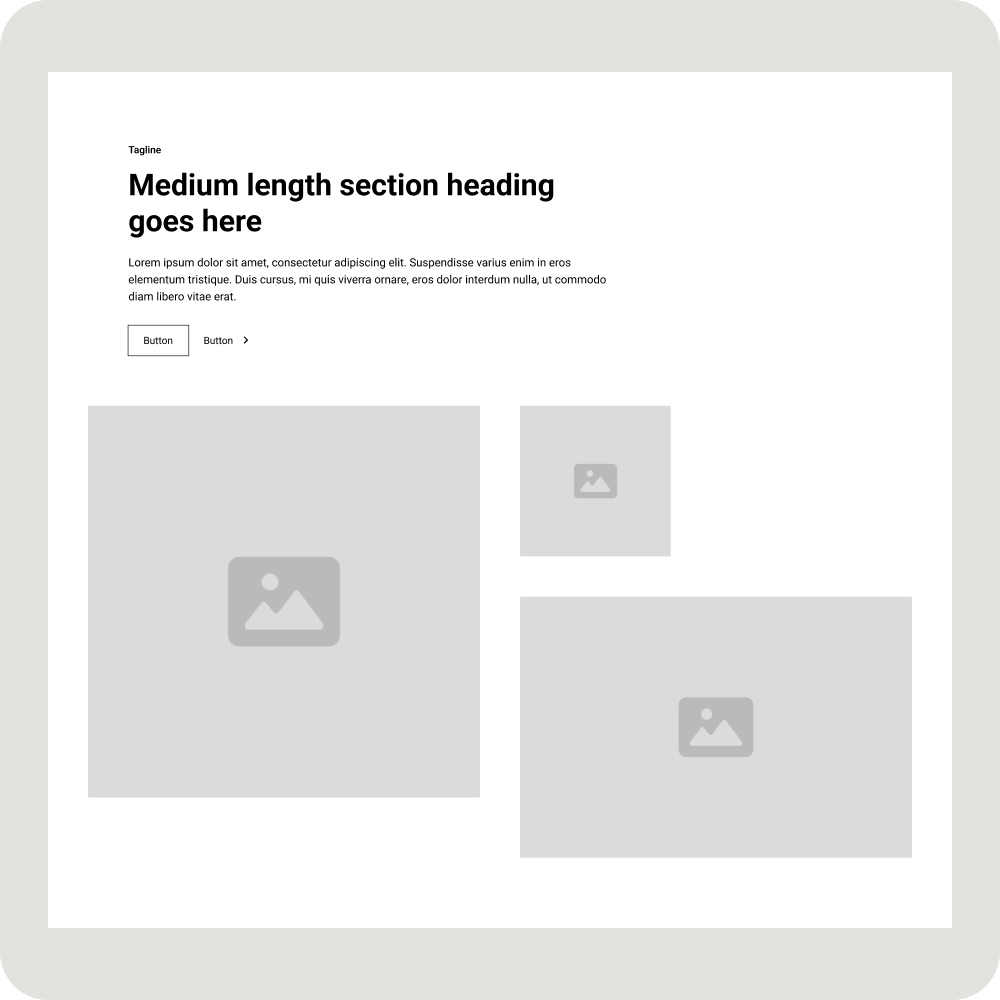
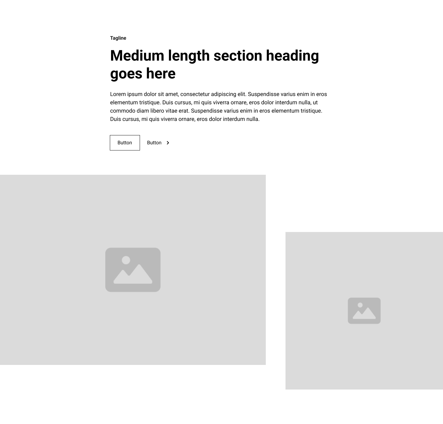
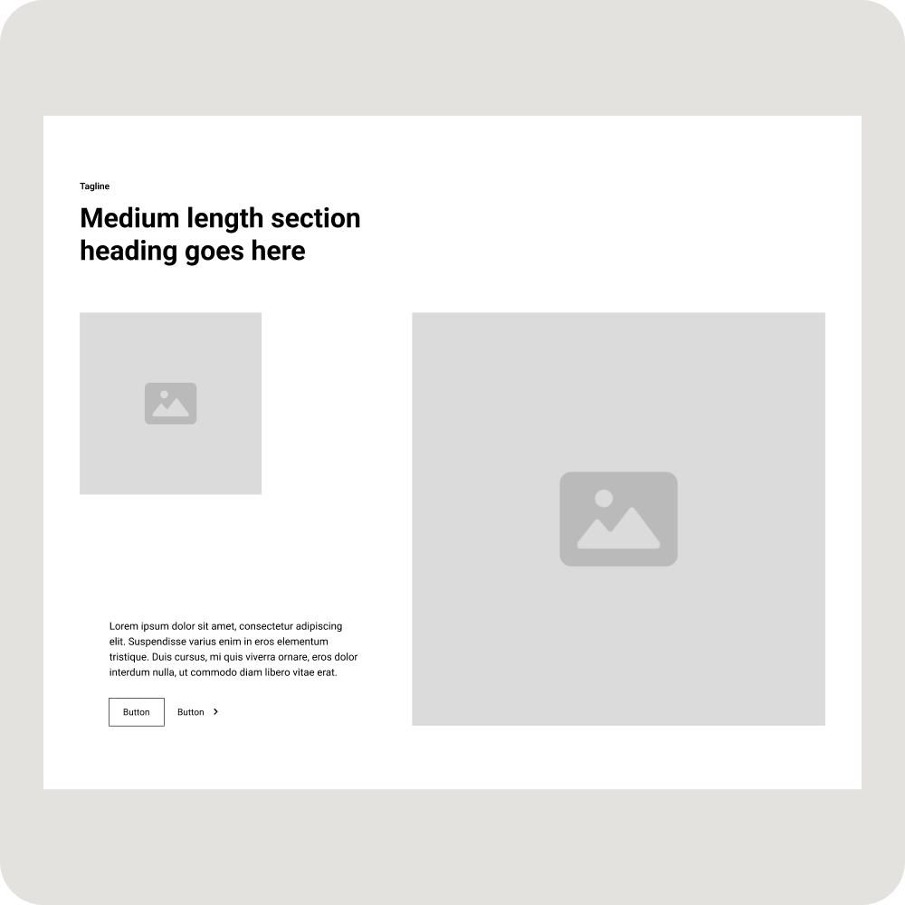
Components with layouts that break the common grid and container boundaries.
More Application UI
More application UI including Page Templates, Components such as feeds and modals, and UI Elements such as badges, date pickers and sliders.

More Feature Sections with Tabs
More feature sections with tabs that have interactions and animations.

Novel 404 Pages
Broken link? No worries! Delight users with a memorable 404 experience!

Uncommon Footers
Give website visitors a pleasant reward for reaching the bottom of your pages with creative Uncommon Footers!

Alerts and Notifications
Notification modals used for cookie consents, newsletter sign ups or web app notifications.

Comparison Sections
Display information side by side to enable users to easily compare different products, services, or features.





.webp)

.webp)
.webp)


