


What's new
Updates and improvements to Relume.

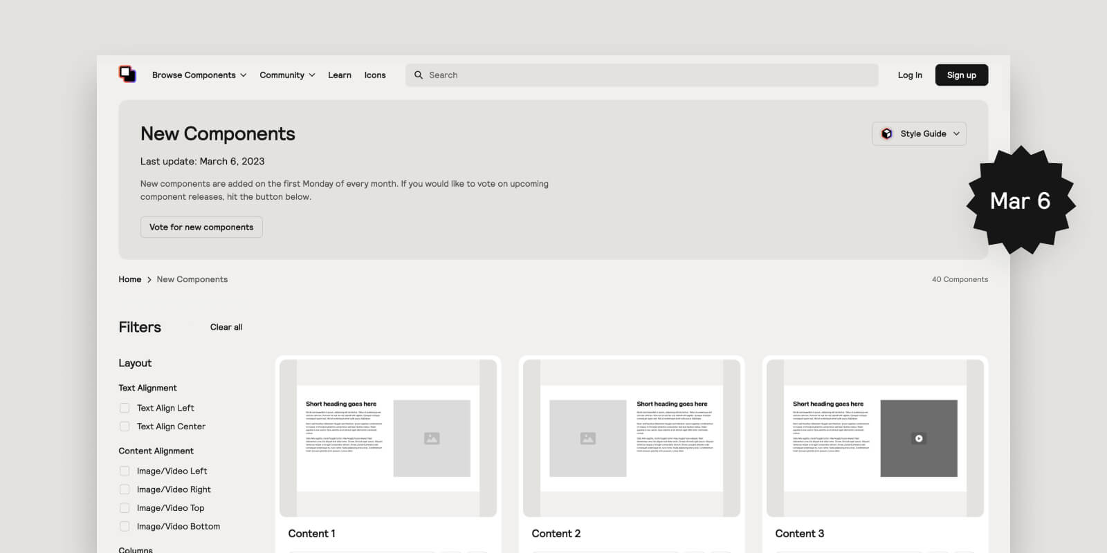
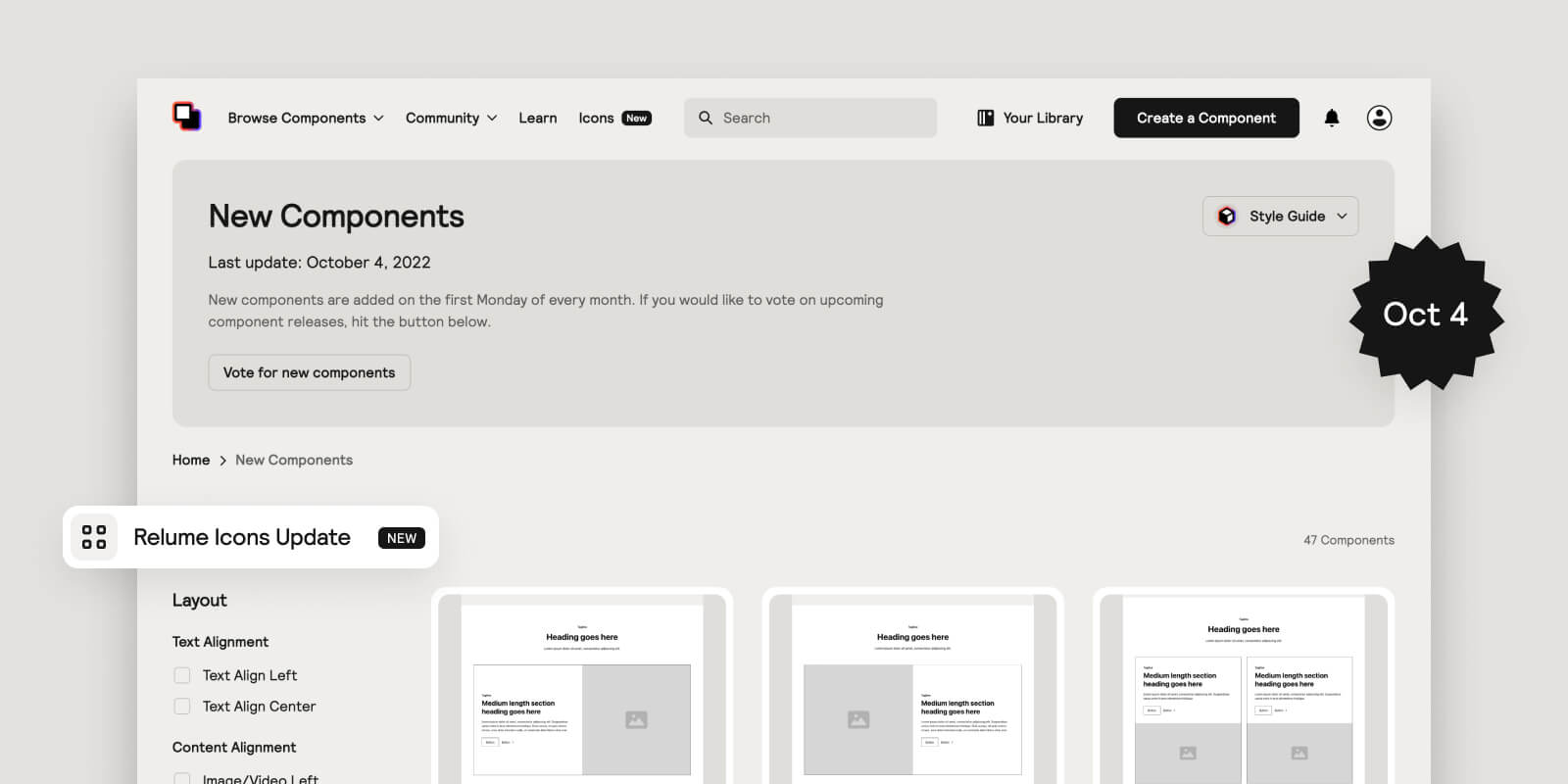
Webflow App, Uncommon Components & React Library Beta
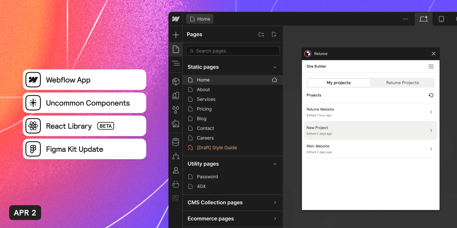
We've launched our first Webflow app, Site Builder Import, which simplifies the process of importing pages from Site Builder to Webflow. We've also introduced 8 Uncommon Components to our collection for use in Figma and Webflow. In addition, the Relume React Beta, offering 100 blocks and common UI elements, is now open for use. Lastly, our Premium Figma Kit has been updated with all new 8 components.
More Editing Power in Site Builder and Timeline Sections
.png)
We have introduced the ability to remove elements in Site Builder for faster wireframe adjustments. Lumers can also reset components to recover deleted elements. Additionally, new Timeline Sections are now available, designed to creatively display stories, processes, or historical events.
UX Improvements, Page Prompting, Multi-language Generation & Overlapping Image Sections

In our latest update to the Site Builder, we have made several UI/UX improvements to enhance your experience. We have made changes to the sitemap navigation, added a sitemap bar, and introduced the ability to generate empty pages. We are also excited to introduce page-based prompting, which allows you to refine sitemaps and wireframes with specific prompts. Additionally, we have unveiled a new sitemap UI, introduced multi-language generation (in beta), and released overlapping image sections for dynamic web design possibilities.
A new website to mark a new chapter

Today, we 're excited to launch our new website to mark a new chapter in Relume. The new website includes a fresh home page, an updated design language, and a new dashboard design that allows for more efficient access to projects and resources.
Color Variables, Off-grid Sections, Multi-step Forms & Style Guide Updates
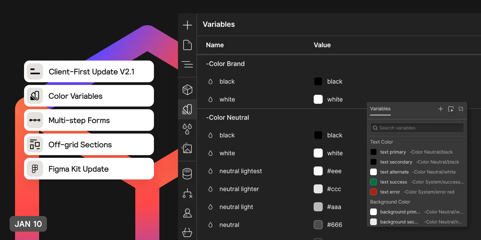
We have released new components and updates for January Component Day. These include the addition of Color Variables to our Webflow & Figma Library, the release of new Off-grid sections, and Multi-step forms.
Commenting & Ask AI Text Editing in Site Builder, Event & Stats Components and Class Sync updates.
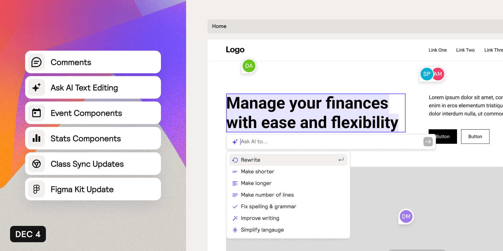
We have released new components and updates for December Component Day. These include Commenting and Ask AI Text Editing in Site Builder, as well as Event and Stats components and Class Sync Updates.
Text Editing in Site Builder, Uncommon Components and other small improvements
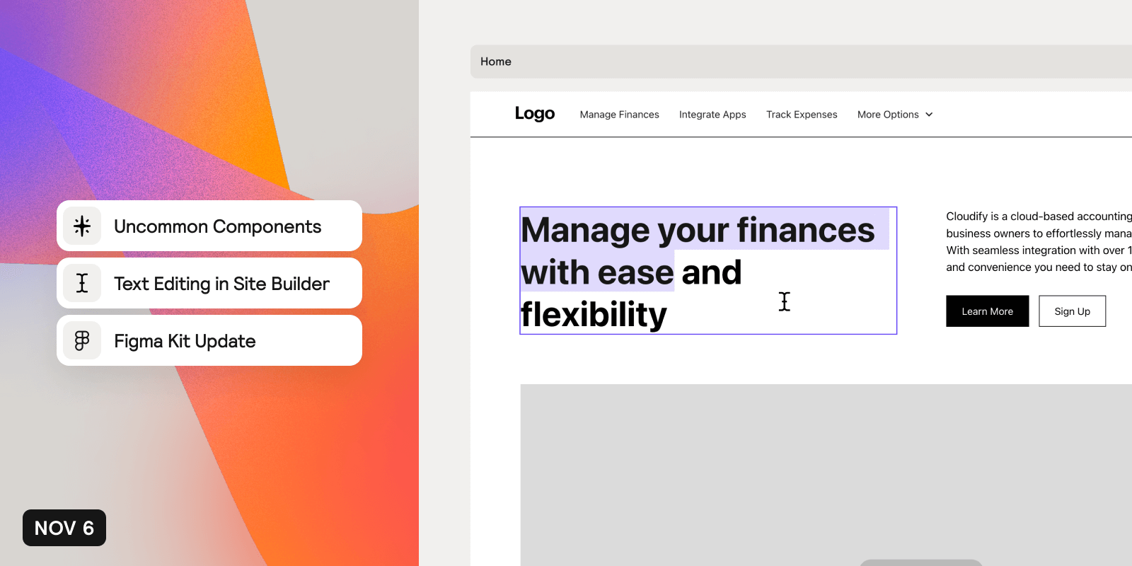
We have released new components and updates for November Component Day. These include new Uncommon Components, Text Editing in Site Builder and other small improvements.
Uncommon Components, Application Components, Team Billing, Shared Workspaces and More.
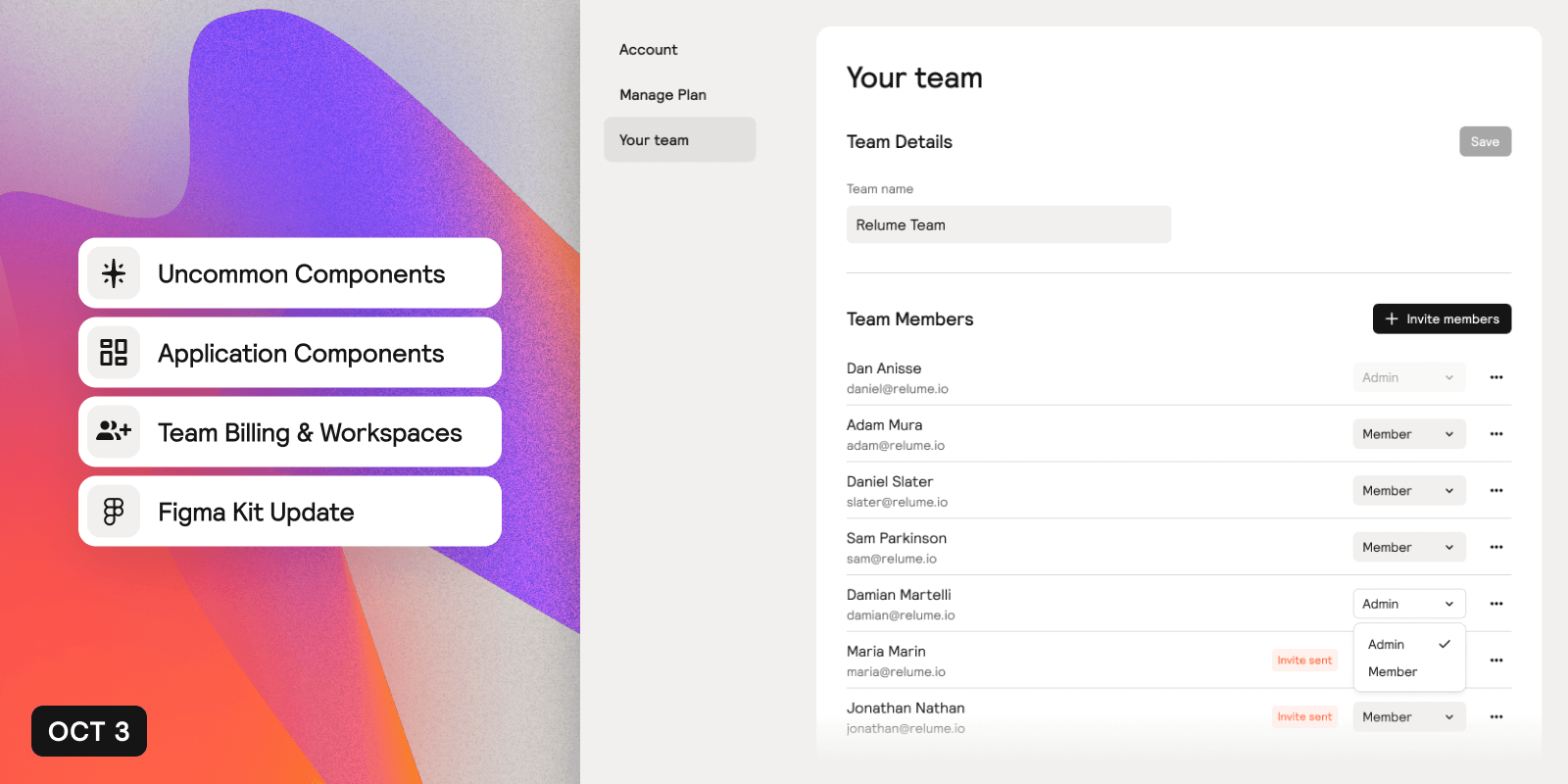
We have released new components and updates for October Component Day. These include uncommon components, application components, new UI elements, updates to our Pro Figma Kit, and improvements to our account management system, such as team billing and shared workspace features.
Site Builder Updates and New Application Components
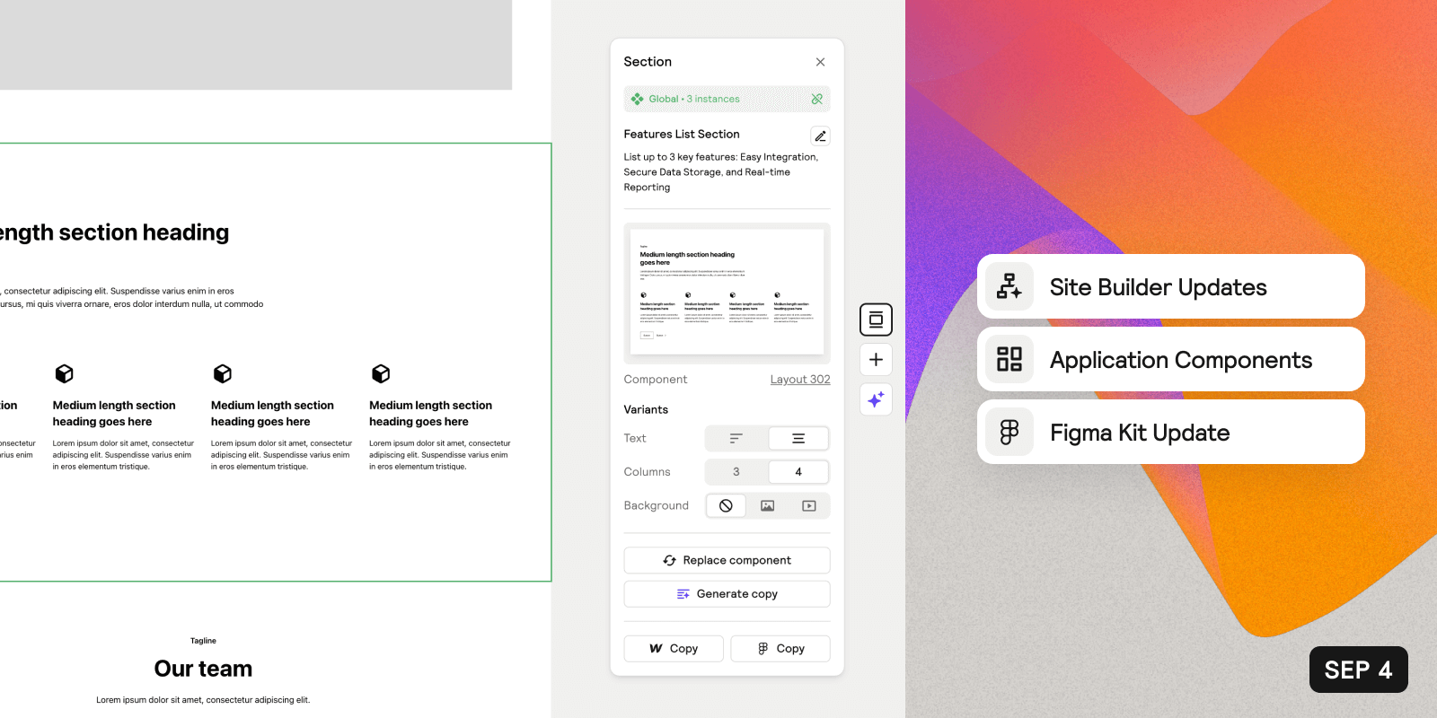
We have released new components and updates for September Component Day. These include new application components, as well as Site Builder features and improvements such as Variants, Global Sections and more.
Introducing the Relume Library Site Builder
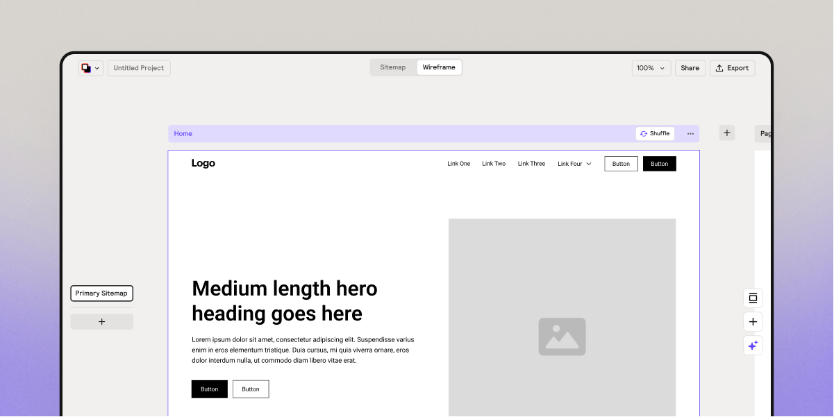
Build a sitemap and wireframe in minutes with the help of AI. Easily export to Figma and Webflow once you’re done.
Application Components, Sitemap Builder Updates and Pro Figma Kit v1.1
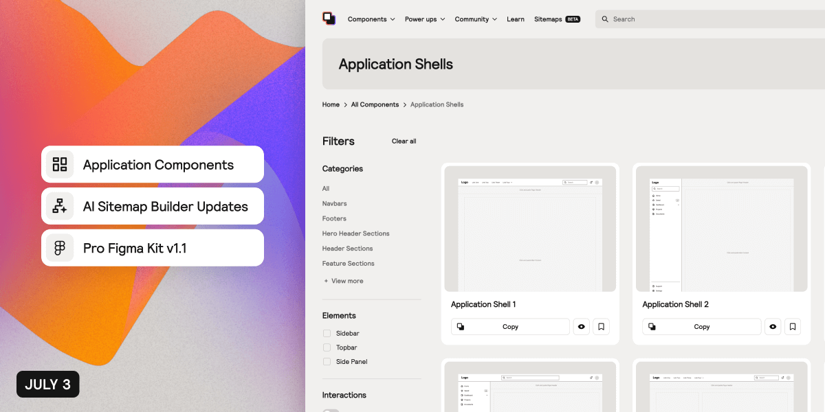
We have released new components and updates for July Component Day, including Application Components, Sitemap Builder updates such as Color Tagging and Sharing, and new application components and icons added to the Pro Figma kit.
AI-powered Sitemap Builder, Uncommon Components, Mobile Version of Figma Kit & Spacing Automations
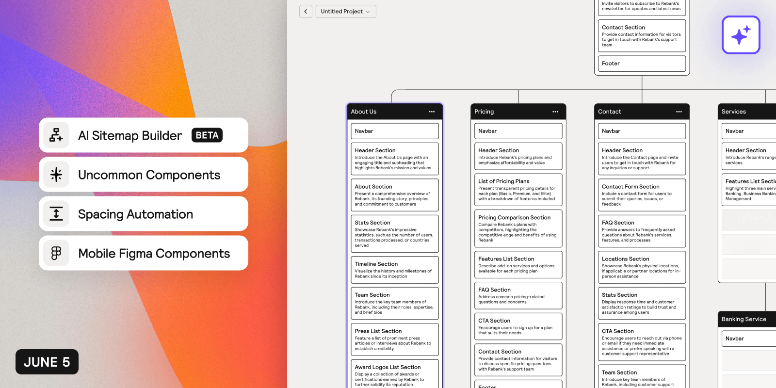
We've released new components, updates and features for June Component Day, including an AI-powered Sitemap Builder, Uncommon Components, Mobile Version of Figma Kit and Spacing Automations.
Inspiration Feed, Tooltips, Loaders & More
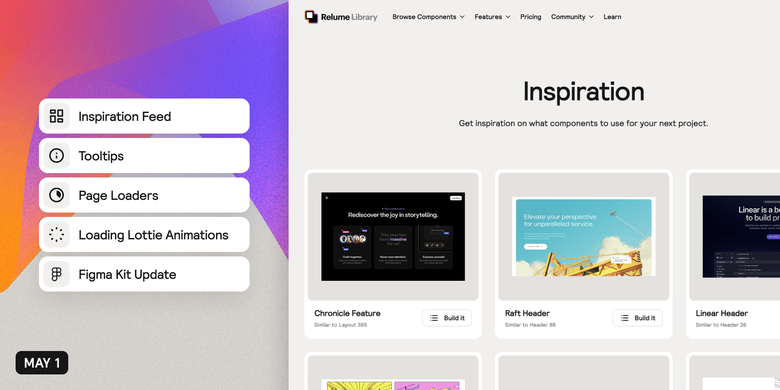
We've released new components and updates for May Component Day, including an Inspiration Feed, Tooltips, Page Loaders, Loading Animations, and an update to community sharing. The Figma Kit has also been updated with new components and UI elements.

Big Updates to Relume Chrome Extension
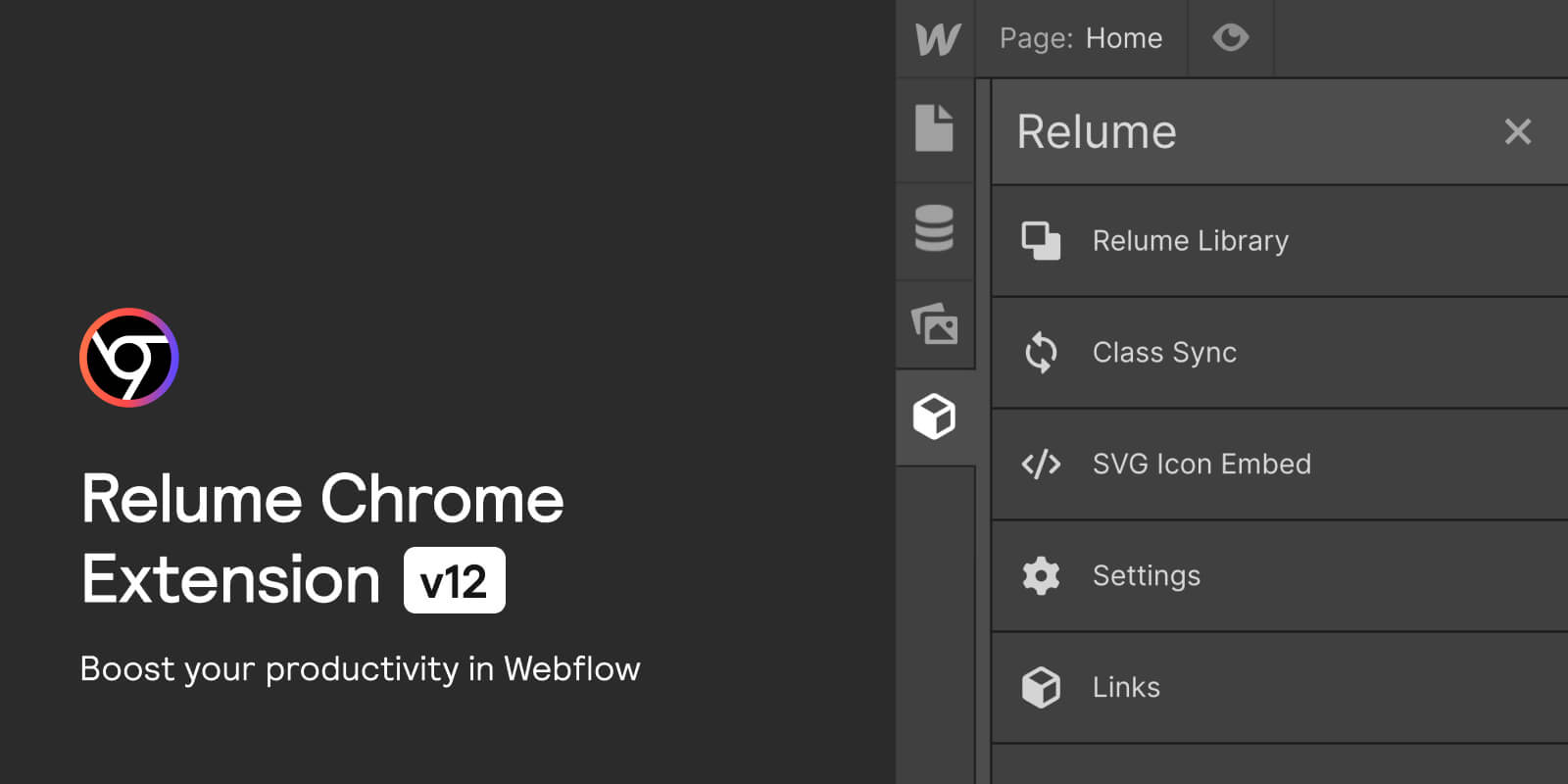
We've made some updates to the Relume Chrome Extension to help streamline your workflow. Access all 1,000+ components including UI Elements and Page Templates inside of Webflow, convert SVG icons to embeds, and more.
New components and updates have been added to the library
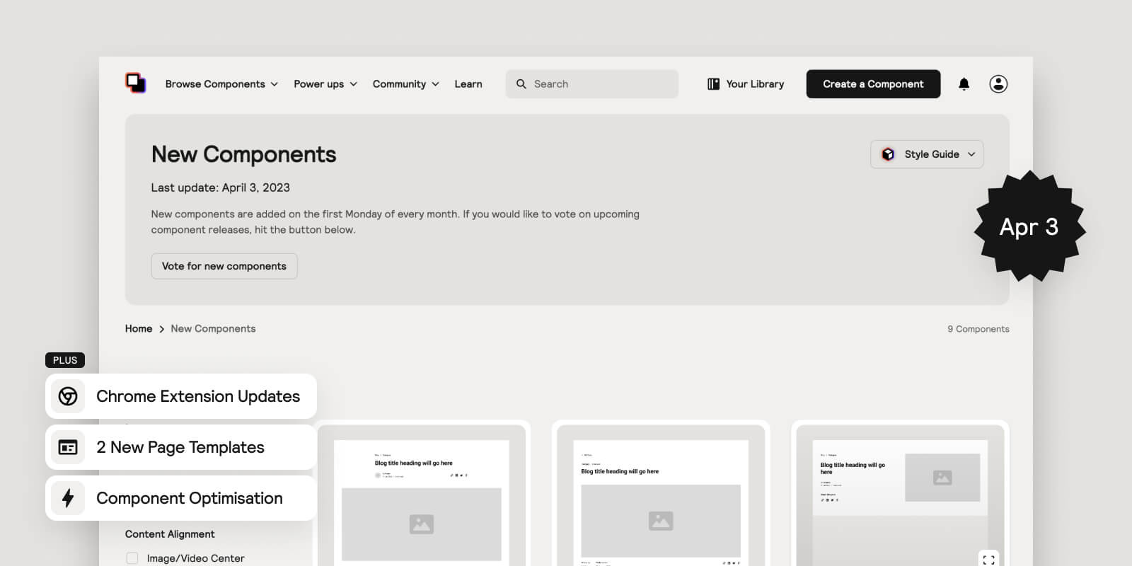
Hey Lumers, It’s a new month which means we’ve released some new components and updates to improve the Relume Library. Happy April Component Day! It’s a BIG one
These include:
- Access all components inside of Webflow
- 1,000+ Relume components, UI Elements & Page Templates - With the Relume Chrome Extension you can access all Components, UI elements and Page Templates all from within Webflow.
- Recently Used components - Easily find components you've recently used without leaving Webflow.
- Saved components - Save components and quickly access them in Webflow.
- Your Library components - Create your own components, save them to Your Library and access them from any project in Webflow.
- SVG Icon Converter - Copy SVG files from Figma and paste them directly into your Webflow project. Icons are automatically converted into a friendly format for Webflow development.
- Blog Post Components - Our Blog Post components have been replaced by our newly released Blog Post Header and Long Form Content Sections. This allows more flexibility and enables you to mix and match components to build the perfect blog post for your website. You can construct your own blog post pages combining these new components or if you would like a prebuilt blog post template you can use one of our Blog Post Page Templates.
- 5x Blog Post Headers - Headers made specifically for a Blog Post page.
- 4x Long Form Content Sections - Long Form Content Sections perfect for Blog Posts pages.
- Figma Kit Update (v1.13) - We’ve added all new components and Page Templates to the Figma Kit. To receive the latest update, make sure you copy version 1.13
- Component Optimisations and Bug Fixes
- Updated Pricing Tables to work on mobile (Pricing 21, Pricing 22, Pricing 26 and Pricing 27)
- Replaced images with SVG embeds on smaller icons to make our components easier to update and play better with Relume Icons.
- Rebuilt Blog Post Page Templates with new Blog Headers and Long Form Content Sections.
- Updated components to utilise new small, large and dynamic viewport units where appropriate.
- Optimised Header 83 for mobile.
New components and updates have been added to the library
It’s a new month which means we’ve released some new components and updates to the Relume Library. Happy March Component Day!
Here’s what new:
- 28 x Long Form Content Sections - Built with Rich Text, these components are designed to be versatile so you can use them on any page which requires long-form text content. Perfect for portfolio pages, support pages and legal pages. See the new components.
- 12 x Portfolio Headers - These new header components are designed specifically for portfolio pages and showcasing a project or piece of work. See the new components.
- 7 x Portfolio Page Templates - Combining our brand new Portfolio Headers and Long Form Content Sections, we've put together Portfolio Page templates so you can quickly and easily show off your latest work. Find out more here.
- Figma Kit Update (v1.12) - We’ve added all 40 new components and 7 page templates to the Figma Kit. To receive the latest update, make sure you copy version 1.12
New components and updates have been added to the library
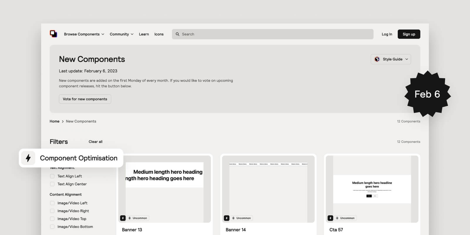
We're excited to announce the latest components and updates to Relume Library. Happy February Component Day!
Here’s what's new:
- 6 x Uncommon Components - We know how much this community loves an Uncommon Component, so we've built more of them to help your websites stand out. These come in the form of Hero Headers, Banners and CTA Sections. See the new components.
- 6 x Feature Sections with Tabs - The library feels more complete after building these components. They're great for adding more content to a page without increasing the page length and scroll. See the new components.
- Client First Interaction Naming - We worked closely with the team at Finsweet to develop the official Client-First approach for naming Interactions in Webflow. We've updated all our interaction names to make sure they're in line with the new guidelines. Find out more here.
- Component Optimisations & Bug Fixes - We’ve been working behind the scenes to optimise existing components so that they are faster to build with, easier to update and more robust. Key changes included updating all components that were using 100vw to solve issues with scrollbars on desktop and setting header images to 'eager loading' to make sure images are visible when the page loads.
- Figma Kit Update (v1.11) - We’ve added all 12 new components to the Figma Kit. To receive the latest update, make sure you copy version 1.11
New components and updates have been added to the library
.jpg)
We're ready to start 2023 off with a bang! Here's the latest new components and updates to Relume Library. Happy January Component Day!
Here’s what's new:
- 16 x Portfolio Sections - Every great Webflow developer needs a great portfolio site to show off their work! Make your New Years Resolution of getting that portfolio together a breeze with our new portfolio sections. They're built to easily connect to your CMS so you can add new projects in seconds! See the new components.
- 1 x Uncommon Portfolio Section - Make your portfolio stand out from the rest with our uncommon portfolio section! See the new component.
- Most Popular Sort - We've added the option to sort by Most Popular to Relume Library saving you time finding and using our most used components. Look for the sort dropdown in the top right corner on any Relume Library Component list page.
- Figma Kit Update (v1.10) - We’ve added all 17 new components to the Figma Kit. To receive the latest update, make sure you copy version 1.10
New components and updates have been added to the library
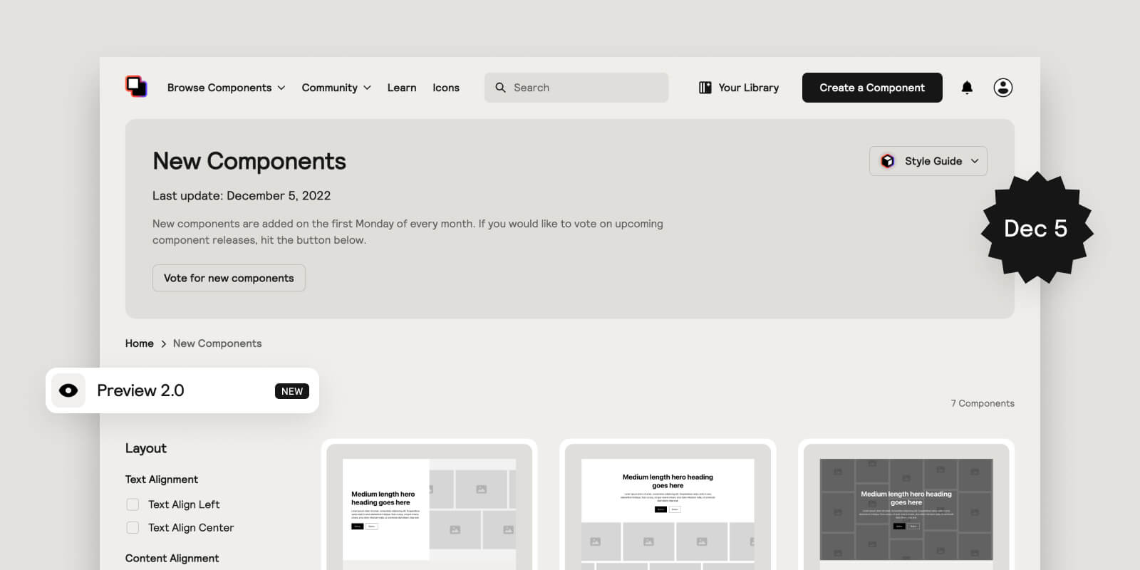
We’re excited to announce the release of new components and updates to Relume Library. Happy December Component Day!
Here’s what's new:
- 7 x Uncommon Headers - There’s no section more important to a website than the Hero Header Section. That’s why we’ve built more Uncommon Hero Header Components that give your website that “wow” factor. See the new components.
- 18 x Hero Headers (Cards) - Continuing with the trend of Card components, we’ve built more of them in the form of Hero Headers. See the new components.
- 18 x CTA Sections (Cards) - More card components in the form of CTA sections. See the new components.
- 3 x Footers (Cards) - More card components in the form of Footers. See the new components.
- Preview 2.0 - We’ve improved our Preview feature so you can preview components at different breakpoints and copy specific UI elements inside of components. Try it for yourself.
- Figma Kit Update (v1.9) - We’ve added all 46 new components to the Figma Kit. To receive the latest update, make sure you copy version 1.9.
- Relume Chrome Extension Beta (Class Sync) now available to all users - Our Chrome Extension Beta is now publicly available. If you haven’t tried it already, now you can! Try it for yourself.
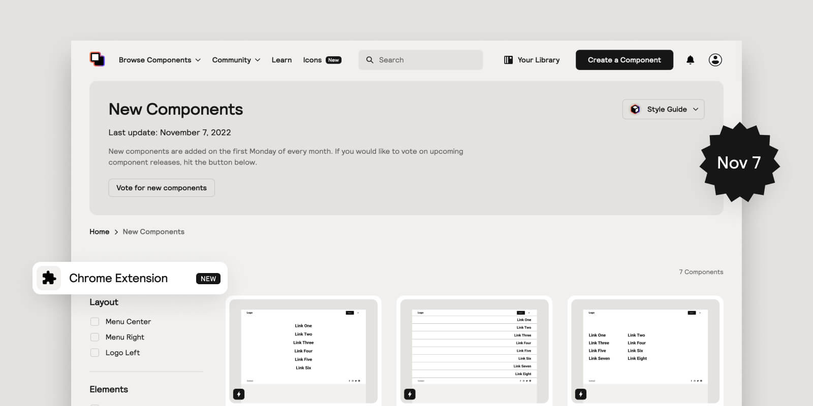
New components and Chrome extension beta release
It’s a new month which means we’ve released some new components and updates to the Relume Library. Happy November Component Day!
These include:
- Chrome Extension Beta with its first feature - Class Sync - Class Sync solves the biggest pain point when building with components - class duplication/renaming. Instead of duplicating/renaming classes once they have been styled, you can now choose to sync components with classes in your Webflow project. Simply toggle Class Sync on and copy a component into your Webflow project. This doesn’t only work for Relume components, but for any Webflow element pasted into a project. If you would like to get access to our beta release, visit our landing page where you can sign up for early access. We’ll be inviting all members on paid plans to join over the coming days.
- New Navbar components - Navbar components have been the most popular category of components to date, so we thought it was time to add some more to the library.
- New icons added to Relume Icons - We’ve added the popular open source icon packs Feather Icons and Simple Icons to Relume Icons. That an additional 2,500+ icons available for you to use on any project. Access them here.
- Figma Kit (v1.7) - We’ve added all new Navbar components to our Figma Kit.
New components and updates have been added to the library
It’s a new month which means we’ve released some new components and updates to the Relume Library. Happy October Component Day!
These include:
- Feature Sections with Grid Cards - A web design trend we’ve been observing over the past year has been the use of cards in grids (see examples below). Although many of these layouts can be achieved through the use of existing components, we’ve taken it a step further by building them specifically for this use case. Watch this demo video to learn more.
- 2 New Icon Sets - As requested by you, we’ve added 2 new open-source icon sets to the Relume Icons library which includes Phosphor and Hero Icons.
- Copy to Figma - Now you can easily copy icons to your Figma file with the new Copy To Figma button.
- Figma Kit Update (v1.6) - All new Feature Sections with Grid Cards have been added to our Figma Kit.
New components and updates have been added to the library
It’s a new month which means we’ve released some new components and updates to the Relume Library. Happy September Component Day!
These include:
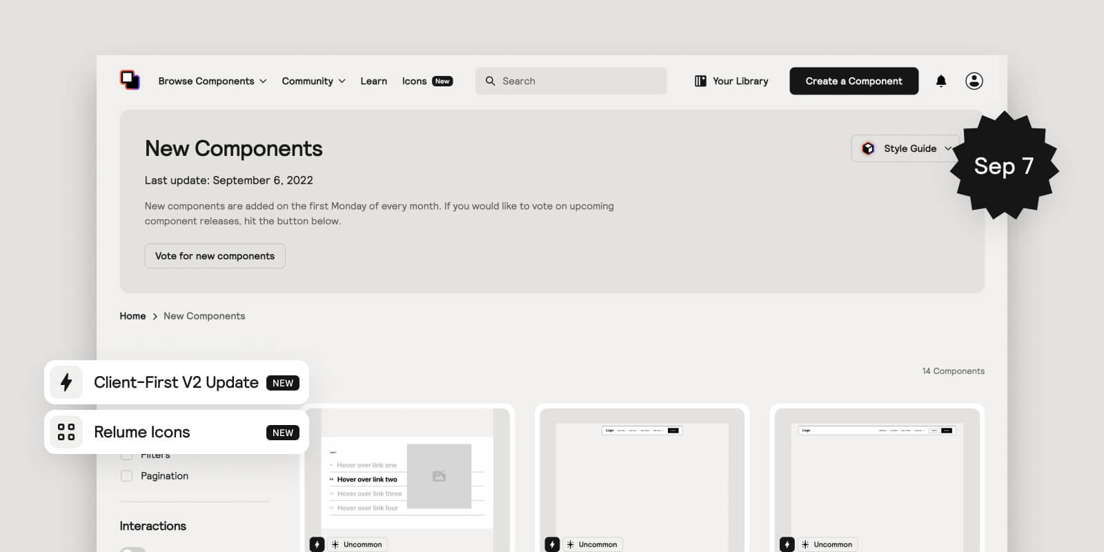
- Client-First V2 Updates -To ensure 100% compatibility with Client-First V2 and Finsweet’s new Folders feature, we’ve made changes to our components and the official Relume Library Style Guide (located in the Starter Project Cloneable). These changes include:
- A new version of our Style Guide (v1.3) containing all Client-First V2 class updates. We’ve also made small adjustments to improve the experience of editing the style guide (eg. removing elements that aren’t commonly used in an attempt to simplify the style guide).
- All components have been updated to adopt the following Client-First V2 updates:
- section-[identifier] has become section_[identifier] to work more effectively with Finsweet’s folders.
- page-padding has become padding-global
- Added the new padding-section-[size] classes to sections in place of using padding-vertical + padding-[size]
- Renamed our heading classes from heading-[size] to heading-style-[h#]
- Renamed our heading classes from heading-[size] to heading-style-[h#]
- Renamed our icon classes from icon-[size] to icon-height-[size]
- Adopted the new Client-First V2 approach to button classes which uses the button class as the global controller of styles for all buttons. For example, button-secondary is now button + is-secondary. We believe this new approach is faster and more flexible.
- Relume Icons - We’ve built an Icon Library for Webflow that contains 5 of our favourite open-source icon packs (16,195 icons in total). Each icon comes with pre-built SVG code that makes controlling icon color and sizing possible in Webflow with HTML embeds. Watch this demo video to learn more.
- If you wish to use your own icons and want a quick way to insert the custom code that enables you to control icon color and size in Webflow, we’ve also built a tool that can help you do that. You can access this on the home page.
- If you want us to include your favourite open-source icon pack, leave a message in the #component-requests channel and we’ll add the most commonly requested.
- Table Components - Building Tables in Webflow just got a lot faster. We’ve built fully responsive Table components that work with CMS collections and can be filtered and sorted using Attributes by Finsweet. All attributes have been added to the components making it much faster to implement.
- Floating Navbars - A trend we’re digging lately that makes your Navbar a little more uncommon. We particularly like the bottom floating Navbar (Navbar 15).
- Navbar Dropdowns - Now you can easily mix and match Dropdowns in your Navbar - combine basic dropdowns with larger mega-menu dropdowns
- Pagination - Add custom pagination to any CMS collections using our pagination components and Attributes by Finsweet. All attributes have been added to each pagination component
- Other - We’ve also added some requested UI elements such as Social Icons and Lists with Icons
- Figma Kit Update (v1.5) - To receive the latest update, you’ll need to copy it again . Here’s what’s been added
- Added a Style Guide - We’ve added a style guide to the Figma Kit so that you can easily global elements from the one place. Watch this demo video by Damian to learn more.
- Added new components - All new Table components have been added to our Figma Kit.
- Component Optimisation & Bug Fixes - We’ve been working behind the scenes to optimise existing components so that they are faster to build with, easier to update and more robust.
Client-First V2 Launches
We’re excited about this launch and will be releasing updates to our components over the coming weeks that include the new Client-First V2 updates.
The updates will be minor and likely won’t impact any existing projects built using Client-First V1 and Relume Library. For the most part, Client-First V1 and Client-First V2 are backwards compatible. You can learn more about the differences between V1 and V2 here.
We’ll begin introducing the new updates starting on September 5 (Component Day). These updates will include:
- A new version of our Style Guide that includes all Client-First V2 updates.
- All components will be updated to adopt the followng Client-First V2 updates:
- section-[identifier] will become section_[identifier]
- page-padding will become padding-global
- New padding-section-[size] instead of using padding-[direction] + padding-[size] for sections
- New heading-style-[h#] instead of using heading-[size] for heading classes
Once we’ve released those updates we’ll be monitoring the use of the new Spacing strategy - Spacing Blocks. At this stage we’d like to see how this new Spacing strategy plays out and would love to hear from you whether we should switch from Spacing Wrappers to Spacing Blocks in our components.
If you have any questions regarding the new Client-First V2 update, please leave them in the thread and we’ll address them.
Thanks for your ongoing support!
Introducing Libraries

It’s the start of a new month which means we’ve released some updates to the library and this time it’s a BIG one. Happy August Component Day! 🎉
Today we’re launching Libraries (aka. Relume Library 2.0)!
What does this include?
- You can now create, save and share your own Webflow component libraries.
- Access to 275 Untiled UI Webflow components - our first community-made library
Introducing the Relume University
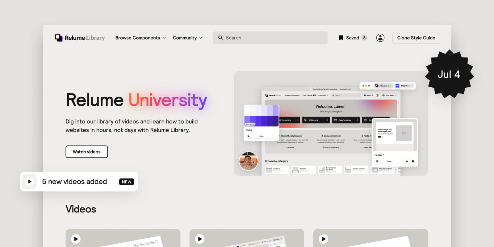
Happy July Component Day!
After receiving many requests to create tutorial videos for the Relume Library, this month we decided to double down on creating content. We are excited to launch the Relume University - a place where you can find videos on how to take full advantage of the Relume Library and improve your productivity and design on Webflow.
This will be the new content hub for the Relume Library. Videos will be released more regularly, along with some articles too, so expect to see new content each week.
There are no new components this month, however, we have a big update coming in a few weeks which includes lots of new stuff, so we’ve been working hard towards that release.
We hope you find the Relume University helpful and we look forward to creating more content for this community.
New components and updates have been added to the library
It’s a new month which means we’ve released some new components to the library. Happy June Component Day!
These include:
- Category Filters - Effortlessly create filters for CMS collections (blogs, resources, products etc.) using our components and Attributes by Finsweet. All attributes have already been added to the components making it much faster to implement.
- More Uncommon Components - Back by popular demand. Uncommon Components involve more sophisticated layouts and Webflow interactions and give your website that “wow” factor.
- More UI Elements - These include more buttons, dropdowns, breadcrumbs and more. We’ve also updated the Page Structure and Section Structure to include padding-vertical (as requested).
Other updates
- Improved Style Guide - We’ve made improvements to our Style Guide to enable more control over styling components. Watch a video of me walking you through the new style guide.
- Color Palettes - Now you can instantly copy and paste Color palettes into your Style Guide, including all the Client-first classes. Watch a video of me walking you through Color Palettes (as part of video above).
- Updated Relume Library platform UI/UX for better speed when you build - Key updates include:
- Improved search bar UX (ongoing)
- Improved filtering UX
- Added a modal for components which features complimentary UI elements and links to resources that can power up components.
- Enabled save function for UI Elements and Page Templates
- Added Flex Gap to entire library - We love Flex Gap, so we’ve added Flex Gap where it’s most suitable. This is part of our commitment to improve our components as better techniques and updates emerge.
- Added interactions to all Navbars - We added better interactions to existing Navbars and will continue to add interactions where it makes sense. We do not want to overdo it, so we’ve taken a very minimal approach but enough to make the components feel premium.
- Figma Kit Update (v1.4) - All new Category Filter components and Uncommon components have been added to our Figma Kit. You’ll need to duplicate it again to receive the latest update.
New components have been added to the library
It’s a new month which means we’ve released some new components to the library (Figma & Webflow). Happy May Component Day!
These include:
- Uncommon Components - These aren’t your typical components, in fact some of them don’t even look or act like components. They are designed to give your websites a spark of brilliance. These components are more complex than others so we will be creating some tutorial videos for them in the coming weeks.
Other updates
- Figma Kit Update (v1.3) - All new Ecommerce components and Page Templates have been added to our Figma Kit. You’ll need to duplicate it again to access the latest update.
- Improved the components so that they are faster to build with, easier to update and more robust.
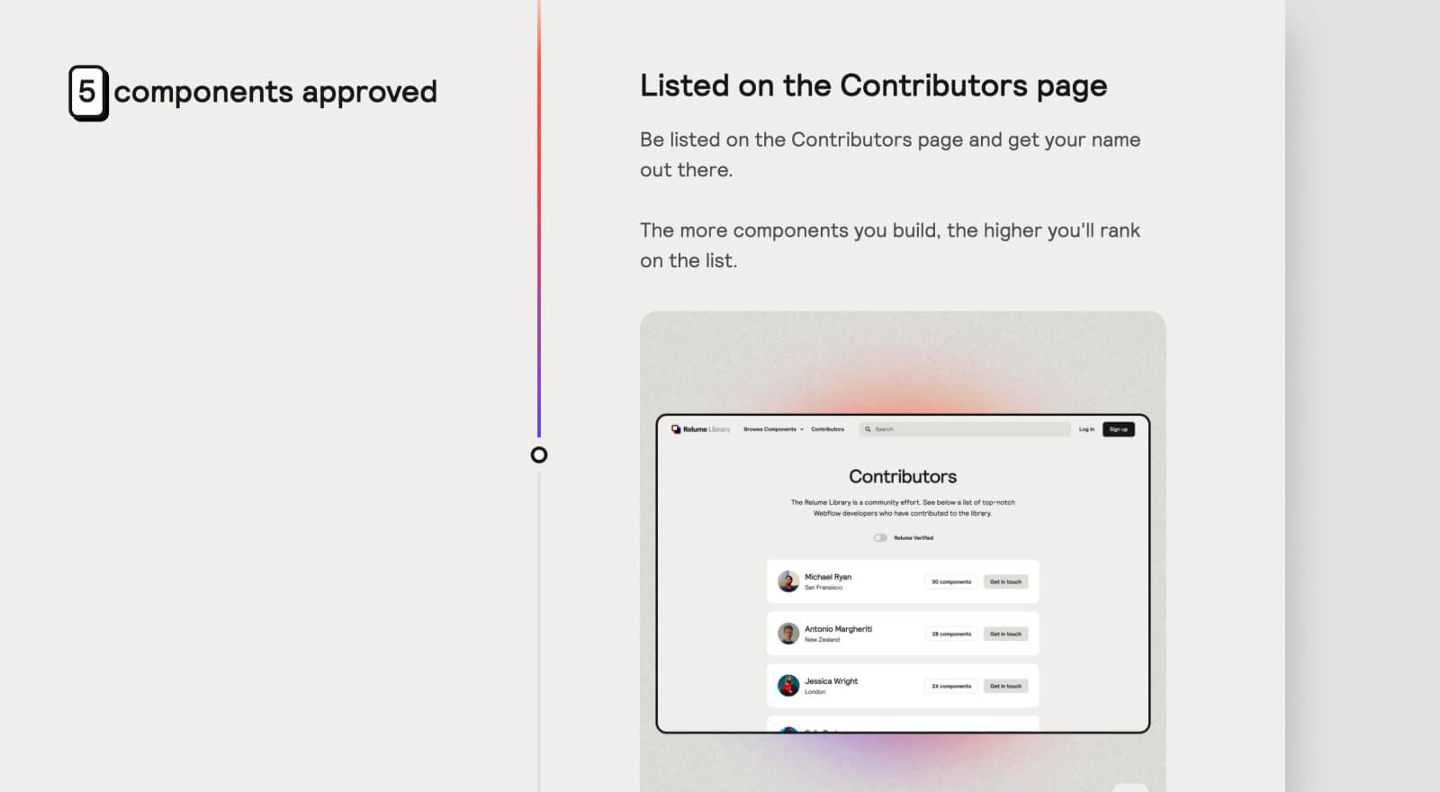
Component Voting 2.0: How it works
.jpg)
Component voting has been a great tool for the Relume team to ensure that we’re spending our time and resources building the right components for the community. Over the past couple of months, since launching the voting board, the team has received lots of positive feedback related to component voting and our ability to deliver on what the community wants. Relume is extremely community focused and we aim to stay that way, which is why we are working to improve component voting so that we can continue delivering value on monthly Component Day releases.
We’ve learn’t a lot over the past couple of months and have decided to make some key changes to how component voting works with the goal of setting clearer expectations with you and reducing internal company chaos during the lead up to Component Day. The latter is very important to our company, we want to maintain a calm work environment for our team so that we can do our best work and deliver the most valuable possible.
In light of these goals, here’s a summary of what’s changed:
- Instead of voting on components to be built in the following month, you’ll now be voting on components to be added to the roadmap each month. Given the difficulty of scoping some components and the varying degrees of scope, it has become problematic at times committing to the release of certain components within a 1 month timeframe. This has resulted in setting unrealistic deadlines and not meeting them or rushing components in order to meet them (causing internal chaos). That’s why we’ve decided to move away from the original approach and move towards a more realistic and flexible approach that enables our team to deliver on the right components in the right amount of time, thus improving the quality of output.
- Instead of components being released on the first day of each month, they’ll now be released on the first Monday of each month. Something we did not consider when originally committing to releasing components on the first day of each month was that, on the odd occasion, that day will fall on a weekend or the day before a weekend. This isn’t ideal if any issues arise and the team needs to be around to solve them (we value time away from our computers on the weekend). Keep in mind that new components require additional updates to the front-end and back-end of our platform. By changing the day to the first Monday of each month, the team will be around to provide support if needed and answer any questions about the release.
- We’ll be adding the top 2 voted items to our roadmap each month. Items that are added to our roadmap will be delivered within 1 to 3 months depending on the scope of work. This number may change as we continue scaling up our internal component team.
What's remained the same
- New components will be released at the beginning of each month.
- Voting will reset each month to ensure votes are most relevant to the existing community.
- When possible, we’ll provide a release date on components so that you know when they are coming.
If you’d like to provide feedback on component voting for our monthly Component Day, feel free to reach out to Adam or Dan on Slack or via email at [email protected].
New components have been added to the library
.jpg)
It’s a new month which means we’ve released some new components to the library (Figma & Webflow). Happy April Component Day!
These include:
- Product List Sections
- Product Headers
Other updates
- Page Templates - We studied hundreds of high-converting websites from the most successful companies in the world and applied our learnings to these templates. This should help you get started with content much easier. Also, it’s a huge time saver being able to copy and paste an entire page.
- UI Elements - You can now copy and paste smaller UI elements which should make customising existing components much easier. For example, if a component is missing a button or a heading, you can add one in (for now we recommend you opening these up in a seperate tab).
- Figma Kit Update (v1.2) - All new Ecommerce components and Page Templates have been added to our Figma Kit. You’ll need to duplicate it again to access the latest update.
- Fixed bugs relating to existing components
- Improved existing components
Enable 100% compatibility with Finsweet's Client-first style guide
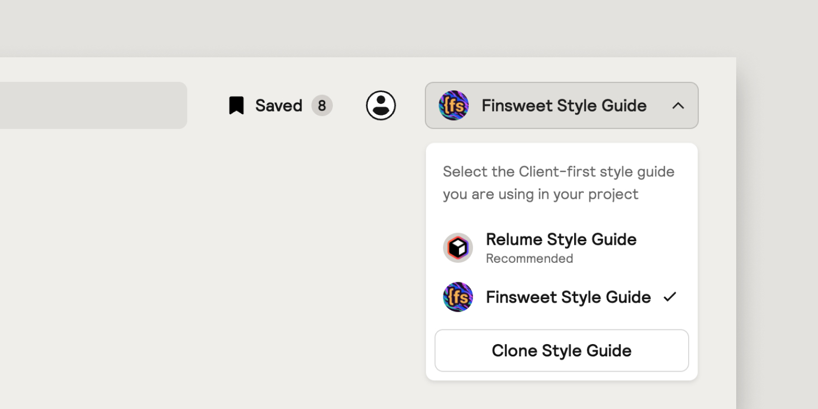
Today we’re launching the Style Guide Selector which you can find in the top right-hand corner of the dashboard. The purpose of this feature is to enable 100% compatibility with other style guides such as Finsweet’s style guide found in their Client-first cloneable, which many of you have used on existing projects. Simply select the style guide you’re using in a project and the components will adjust to the CSS values of the pre-built classes in that style guide and prevent unnecessary class duplication.
Why did we build this? (The problem)
Many of you have reached out regarding class duplication issues when using Finsweet’s style guide with Relume Library components. Although we recommend you use the Relume Library Style Guide, we understand that many existing projects were built using Finsweet’s Client-first cloneable and so we wanted to make sure that our components are compatible with both Finsweet and Relume starter projects to prevent any unnecessary class duplication occurring. This is important because class duplication leads to class renaming, which takes time and reduces productivity, and we care deeply about productivity.
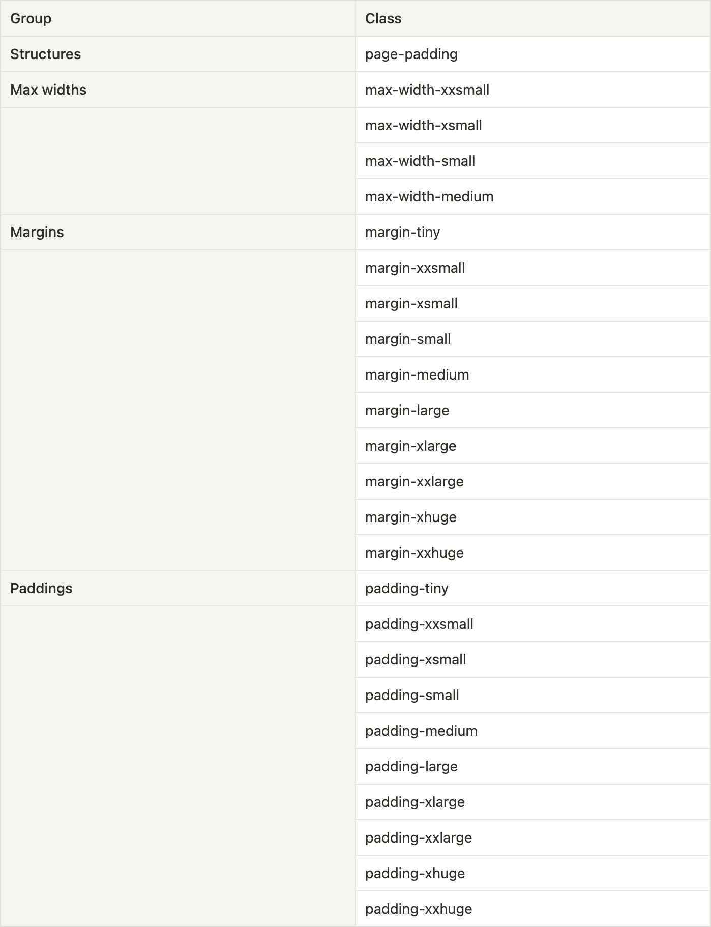
Just to be clear, class duplication in Webflow occurs when two classes share the same name but have different CSS values and properties. For example, let’s imagine you have a .button class in Project A and it has a border radius of 1rem and a .button class in Project B and it has no border radius. If you were to copy Project A’s .button and paste it in to Project B, the button class would duplicate and be renamed to .button2.
Relume Library components have been built using pre-built classes from the Relume Library Style Guide. The same pre-built classes can be found in Finsweet’s Client-first cloneable, however, some of Relume’s pre-built classes have different CSS values, primarily for spacing classes. For example, Relume’s .margin-small class uses 1.5rem, whereas Finsweet’s .margin-small class uses 1rem. One of the reasons why class duplication occurs when pasting Relume Library components into projects that use Finsweet’s style guide (found in Finsweet’s Client-first cloneable) is because the components consist of classes that share the same name but have different values.
For the purpose of transparency, the following classes have different CSS values and would lead to class duplication:
How it works
The Style Guide Selector works by adjusting the CSS values based on the style guide selected. This means that when you switch between style guides, the components will slightly change in appearance to match the selected style guides spacing, typography, colours and UI elements.
Why did we decide to change the values in the first place?
At the time of building this library, we did not anticipate the reception we’d get from the Finsweet community and the issues that would result from pasting components into an existing project that uses Finsweet’s Client-first cloneable. We took the approach of building a library that we at Relume would use, and adjusting the spacing values that fit our design system made the most sense at the time. To this day we still prefer our spacing values (as they skew towards smaller spacing dimensions) and find them to be more inline with our design style, which is why we’re sticking with them for now.
This does NOT solve class duplication completely
The issue of class duplication can’t be avoided at this stage and is the nature of copy and pasting components into Webflow. What can be avoided is the unnecessary duplication of classes due to the conflicts between the two style guides, which we have now solved with the release of the Style Guide Selector. We aim to continue to solve problems around duplication as we believe it has the opportunity to increase productivity and improve workflows.
New components have been added to the library
.jpg)
It’s the first day of the month which means we’ve released some new components to the library (Figma & Webflow). Happy March Component Day!
These include:
- Banners
- Sign up / Log in Pages
- Sign up / Log in Modals
- Contact Modals
- More Footers
Other updates
- Preview feature: You can now preview components in the browser before pasting them into a Webflow project by clicking the preview button.
- Fixed bugs relating to existing components
- Improved existing components
More information
We’re anticipating a few questions so have documented some answers below.
Where are the ecommerce components as promised?
The short answer is that we’re still working on them and will be releasing them as part of our next component day on April 1. We did not want to rush them and so we’re using this extra time to make them as good as possible!
Will you be updating the Figma file with the new components?
Yes, we’ve updated the Figma file with all new components. To access them you’ll need to duplicate the file again on Figma.
Relume Library Figma Kit now available
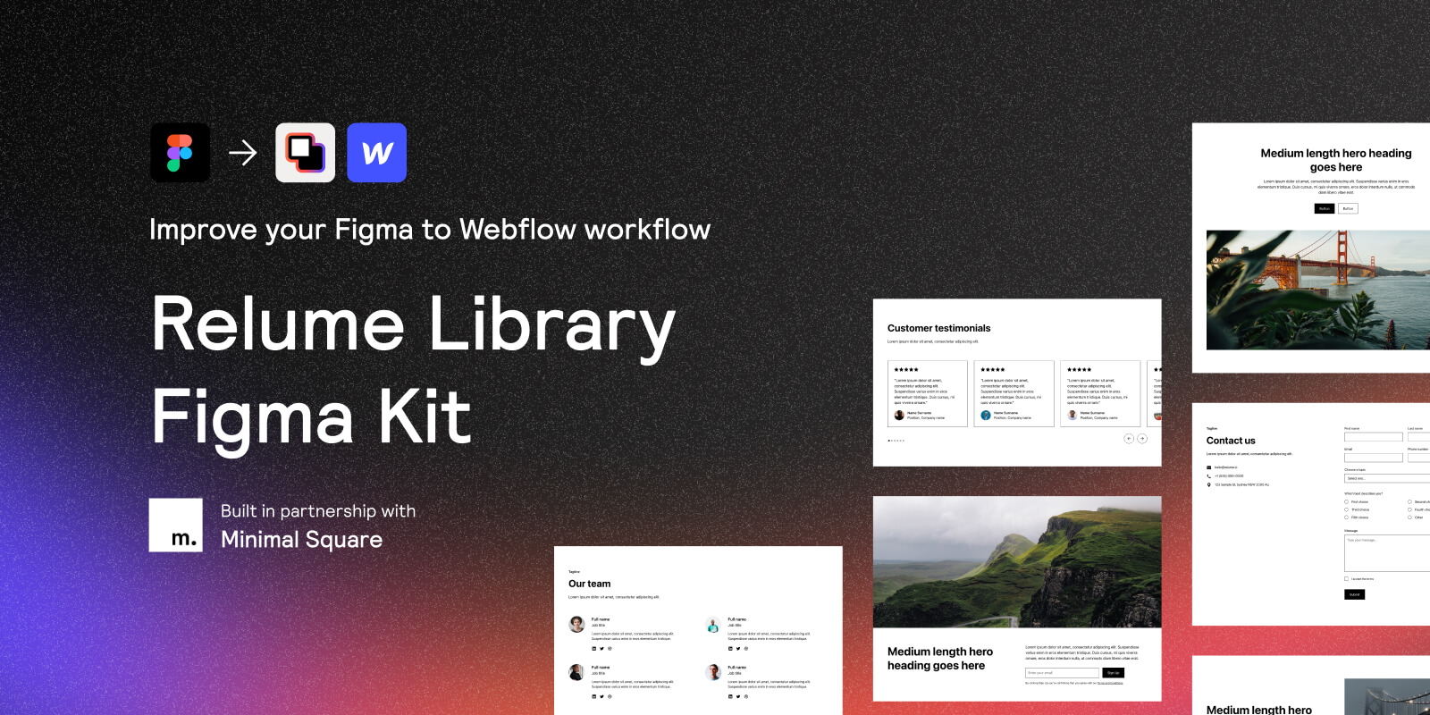
We just released a Relume Library Figma Kit to the Figma community for FREE!
I’ve recorded an introduction video to help you get started.
We’ve created a #figma-kit channel in our Slack where you can ask any Figma Kit related questions or provide feedback. Feedback is very much welcomed!
Lastly, big shout out to the team at Minimal Square for taking the initiative to build this out and give this away for free. It’s an awesome gesture and speaks volumes to the community we have here.

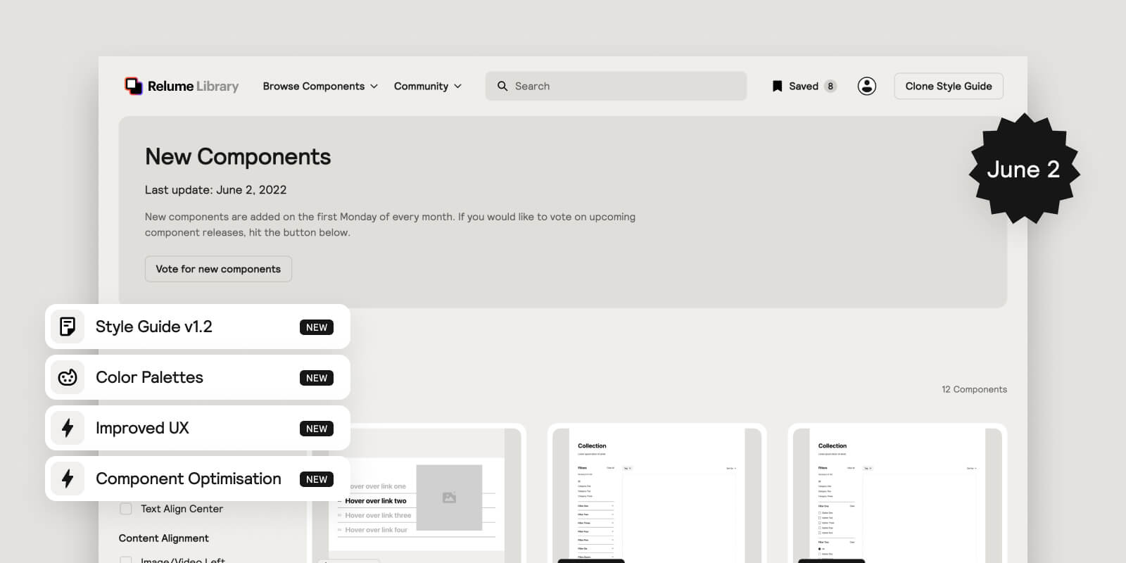
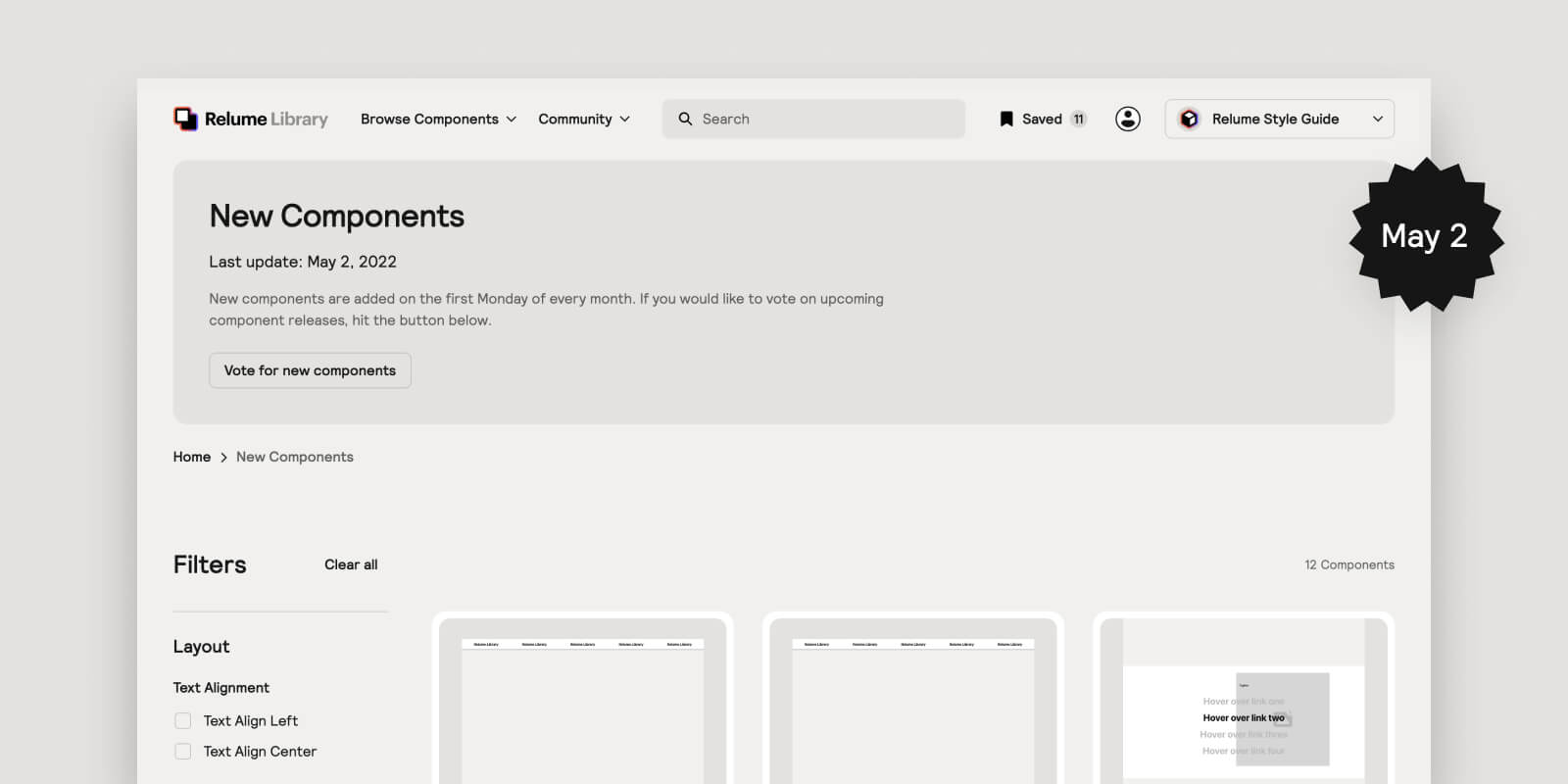
You can now Vote for new components
In order for us to continuously listen to your feedback for Component Day, we’ve decided to create our own voting board where you can upvote which new components you’d like us to build for April 1st Component Day.
Instead of collecting votes over a single timeframe, we are taking the approach of refreshing votes each month so that requests are more relevant to our current members.
You’ll also be able to see the components we are currently building for our next component release.
New components have been added to the library
.jpg)
It’s the first day of the month which means we’ve released some new components to the library. Happy component day!
These include:
- Navbar Mega Menus
- Career Sections
- Gallery Sections
Other updates
- Interactions filter: You can now filter to find components that use interactions. We’ve also added a label that identifies the components that use interactions. After speaking to a few people in the community, we realised that it wasn’t clear that some of our components come with interactions built into them.
- Menu redesign: Opened up the browse components menu for better visibility.
- New Components page: New components page which features the new components released for the month.
Interested in contributing to the Relume Library?
We’re calling on the community to help us build the most epic Webflow component library of all time. Submit components and earn rewards.
Make Relume Library components fluid responsive
A fluid responsive method for Relume Library is now available thanks to our friends at Finsweet. Make your website fluid responsive visually in rems, without writing custom css or making calculations. I’ve created walking you through how to add it to your website (see below).
For account-related issues, please contact [email protected].


.webp)

.webp)
.webp)