


Color Variables, Off-grid Sections, Multi-step Forms & Style Guide Updates
January 10, 2024
It’s a new month which means we’ve released some new components and updates to improve Relume Library. Happy January Component Day!
Here's what's new:
Color Variables
We are excited to announce the introduction of Color Variables to Relume Library as part of Finsweet's Client-First V2.1 update. We have collaborated closely with the Finsweet team over the past month to bring you a powerful framework for managing Color Variables in both Webflow and Figma, making it suitable for projects of any size.
.png)
Helpful Links
Below are some helpful links to get you up to speed on Variables and Client-First V2.1
{{VariablesHelpfulLinks}}
FAQ
Can I use Relume Library with Finsweet’s latest Webflow Style Guide?
Yes, by using the Class Sync feature in our Chrome Extension, you can enjoy seamless compatibility with Finsweet's Style Guide and benefit from the updated Client-First V2.1.
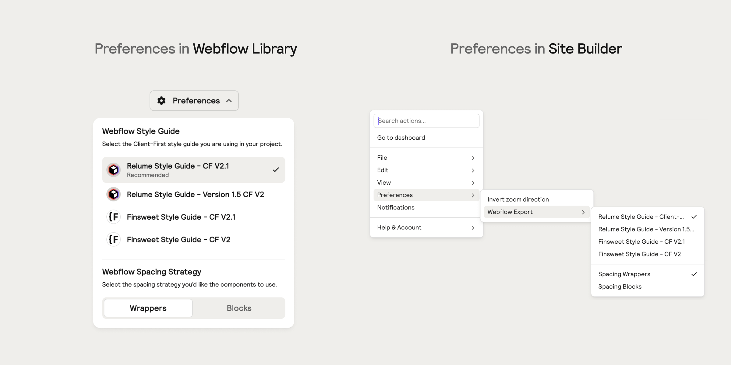
Can I use Relume Library with the old style guides?
Are you using the old Relume or Finsweet Style Guides? No problem. Simply use the preferences dropdown in the Webflow Library or the preferences menu in Site Builder to select which style guide you're using in a project. The components will automatically adapt to sync with the selected style guide. For the smoothest workflow, we recommend using this feature in combination with our Chrome Extension's Class Sync feature.
What about other variables, such as size?
We have decided not to release size variables at the moment because Webflow's variables panel does not support breakpoints. However, once Webflow introduces breakpoints, we will reassess this decision and consider adding more variables to the panel. Currently, our main focus is on using variables for color, as it provides clear advantages.
Will Relume and Finsweet be making more updates to Client-First in the future?
Yes. Both Relume and Finsweet are committed to improving Client-First over time with the help of feedback from the community. One of the initiatives we are exploring is reducing div nesting, so expect to see improvements to Relume components in the coming months.
In addition, we plan on releasing more variables once Webflow introduces more capabilities to the variables panel.
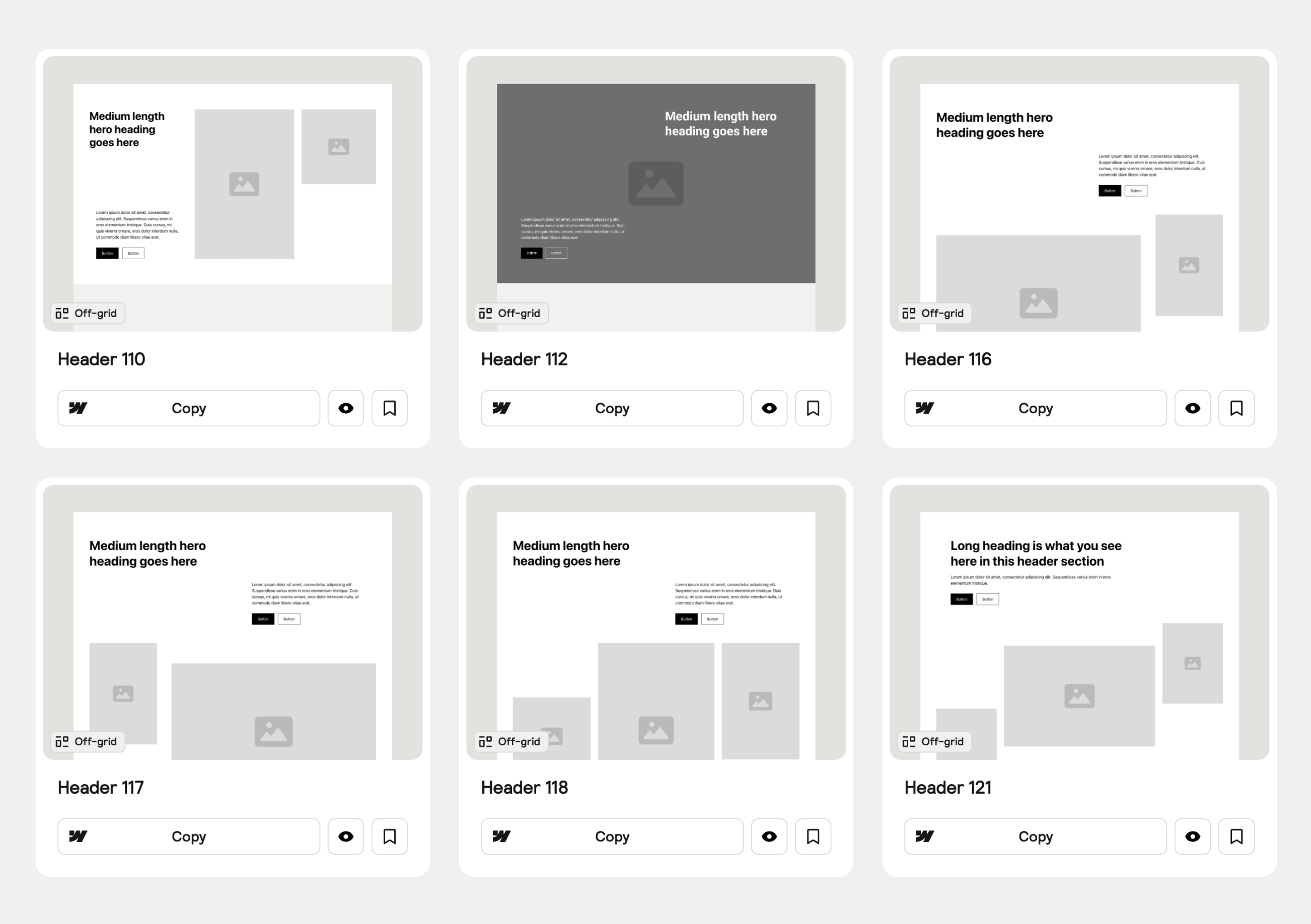
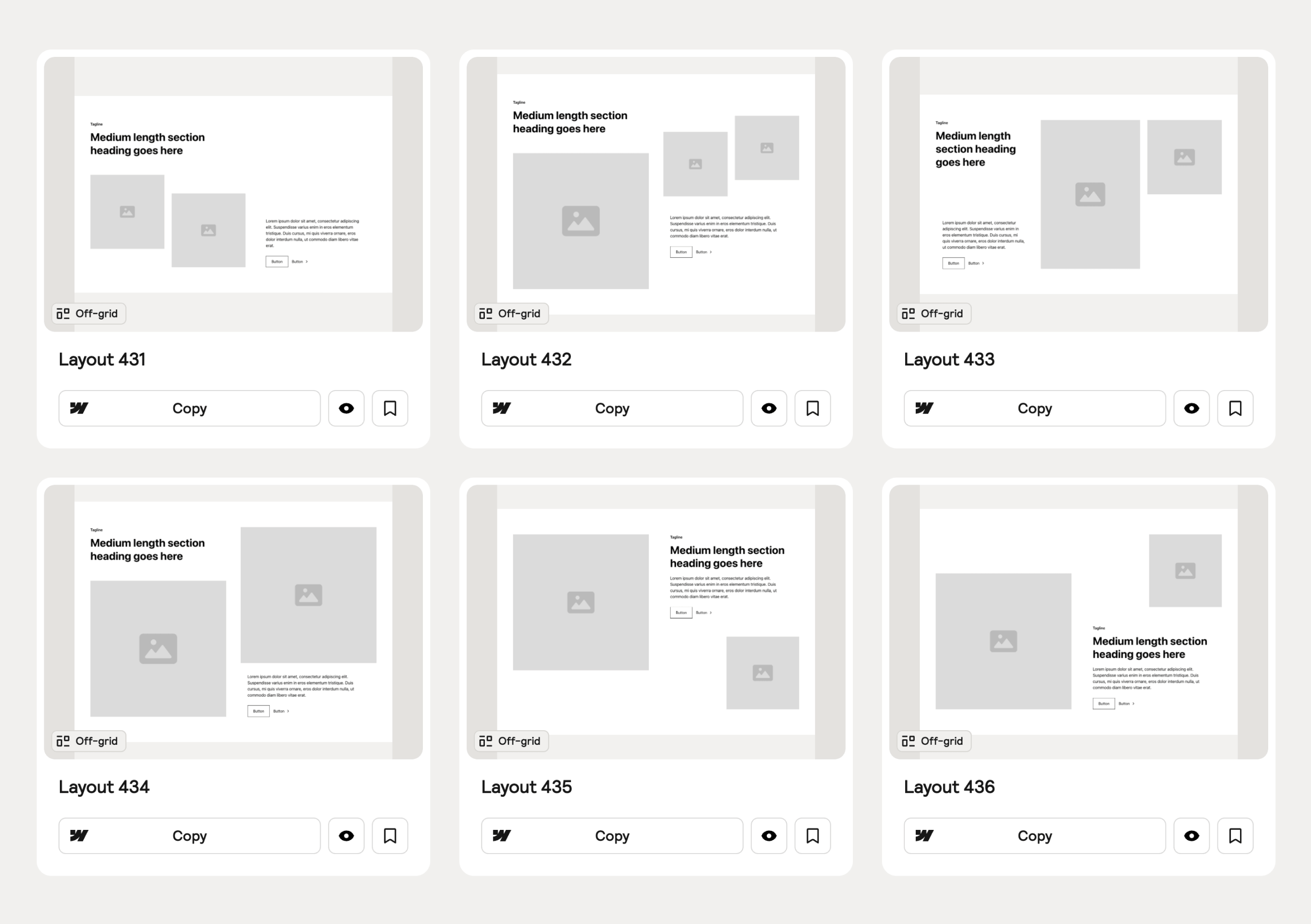
Off-grid Sections
This month marks the debut of our Off-grid Sections, designed to challenge conventional layouts and open up the doors to new possibilities. An Off-grid Section is achieved by the primary layout elements being off-set from the standard columns and rows of a traditional grid system. These layouts empower you to create unique and distinctive sections while maintaining the structure and organization of the Relume design system.
In the future, we plan to expand the 'Off-grid' concept by incorporating it into more section categories, like we did with the 'Uncommon' components. However, for now, we felt it was most appropriate to start with Hero Header Sections and Feature Sections to establish the foundation.
Hero Header Sections
Our new Off-grid Hero Header Sections offer a unique and eye-catching way to engage visitors from the moment they land on your website.
Feature Sections
Our new Off-grid Feature Sections provide a fresh perspective on organizing content, giving you the freedom to design in unconventional ways.
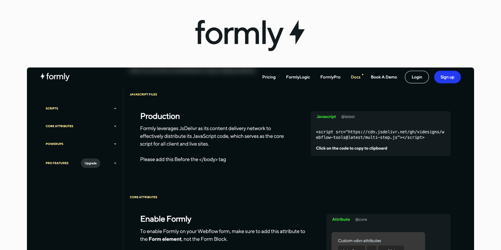
Multi-step Forms
Multi-step forms have been highly requested by the community, and so we decided to partner with Formly, a multi-step form solution for Webflow, to build them. These forms are designed to streamline application onboarding, customer surveys, and marketing efforts. They aim to make form completion less daunting and encourage more user engagement.
{{FormlyLink}}
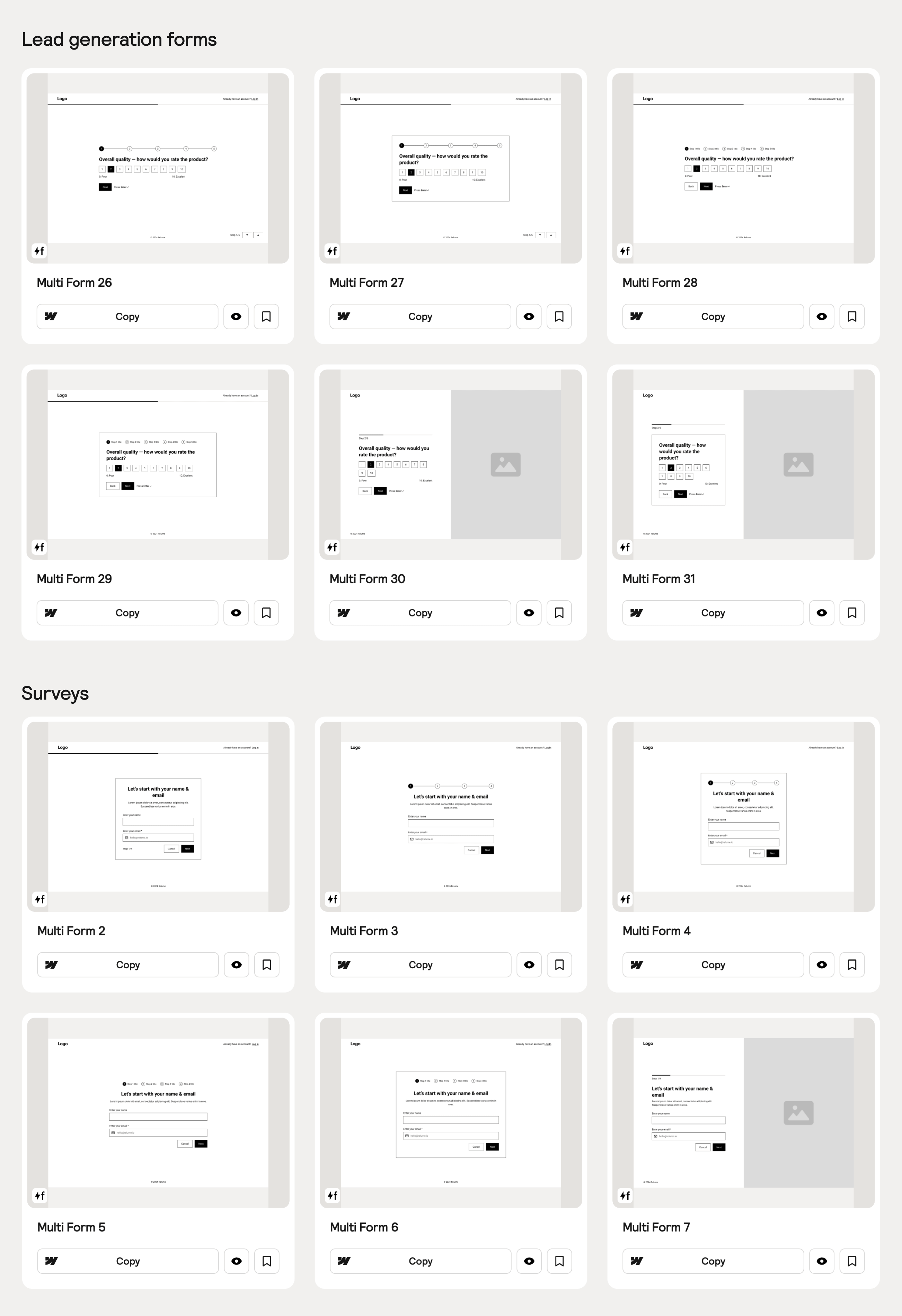
Lead Generation Forms & Surveys
We’ve designed and built multi-step forms for lead generation campaigns and conducting user surveys. By breaking down the form into smaller, more manageable steps, users are more likely to complete the form and provide valuable information.
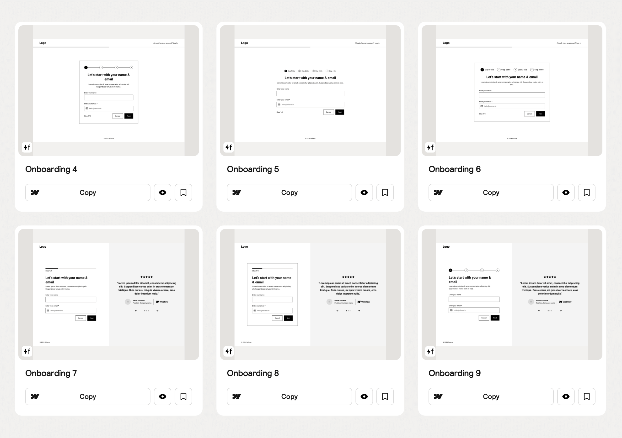
Onboarding Forms
We’ve also built multi-step forms that are ideal for onboarding new users or customers. By guiding users through a series of steps, we can provide a smoother and more personalized onboarding experience, ensuring that users understand the process and feel supported along the way.
Figma Pro Update (V2.0)
We have added Color Variables to the Pro Figma Kit which adopts the same approach established in our Webflow Library based on Client-First V2.1. We’ve also added all 122 new components, which is available in both desktop and mobile variants. To receive the latest update, visit the Figma Kits in your account.

Note: If you have purchased the Pro Figma kit outside of our Relume library plans you will receive the latest update through Figma or via email depending on where you purchased it.
Webflow Style Guide Updates
Changelog (CF V2.0 → CF V2.1)
Below are the list of changes we made to our Webflow Style Guide as part of the Client-First V2.1 updates.
HTML + Rich Text linked to Variables
Classes linked to Variables
Text Color
Background Color
Button Color
Forms
Global Styles
*/.inherit-color * { color: inherit;
}
/* Set color style to inherit */.inherit-color * {color: inherit;}Classes
General
Utility
For account-related issues, please contact [email protected].


.webp)

.webp)
.webp)