


Application Components, Sitemap Builder Updates and Pro Figma Kit v1.1
July 3, 2023
It’s a new month which means we’ve released some new components, features and updates to improve Relume Library. Happy July Component Day!
Here's what's new:
Application Components
Build powerful web apps faster than ever in Webflow with our new application components. These components are designed to work seamlessly together and provide maximum flexibility. You can mix and match them to create the perfect responsive application layout. These components are compatible with no-code platforms like Wized and Webflow's Devlink, allowing you to create robust web application UI directly within Webflow.
Stay tuned for upcoming releases as we extend our collection of application components.
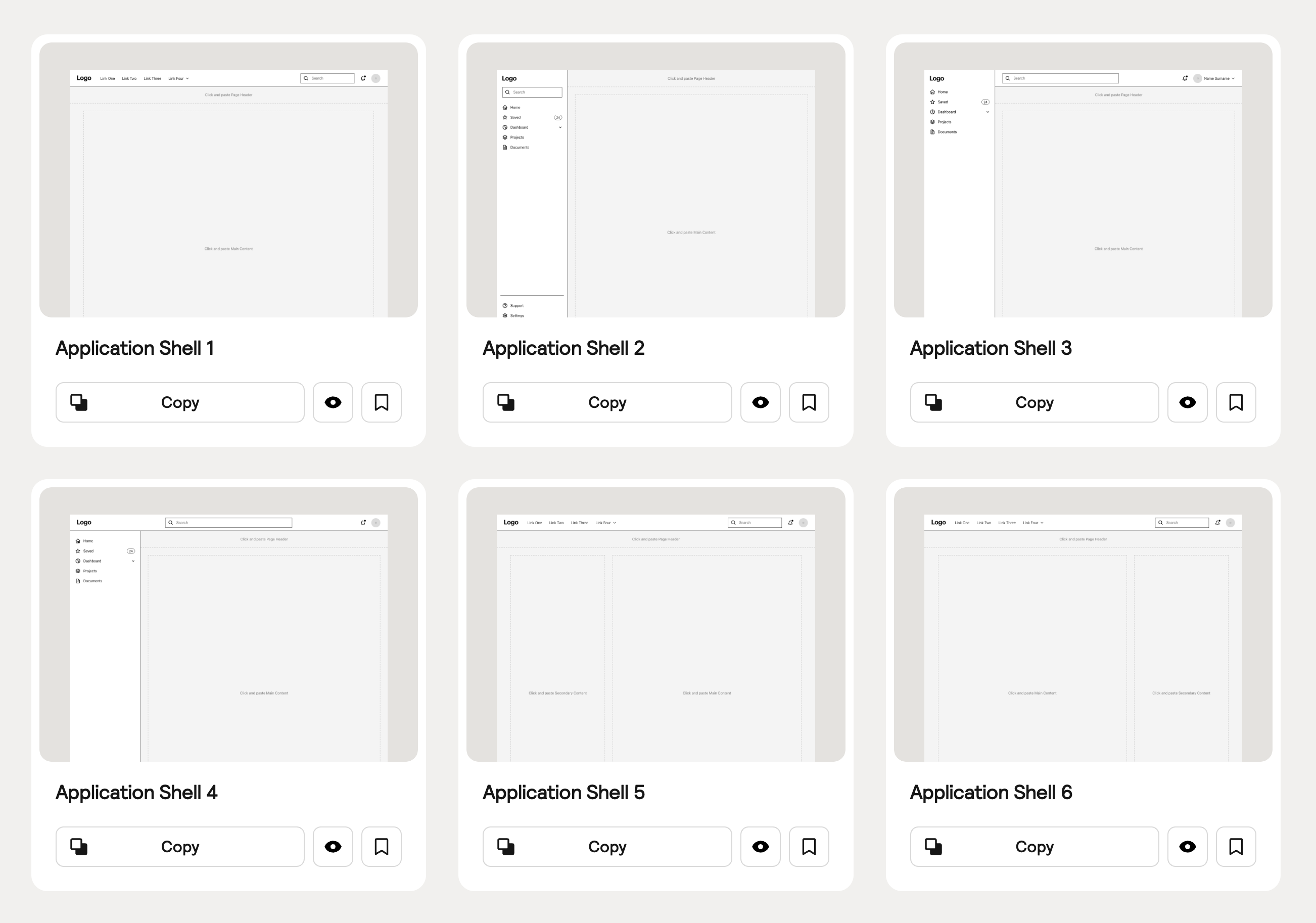
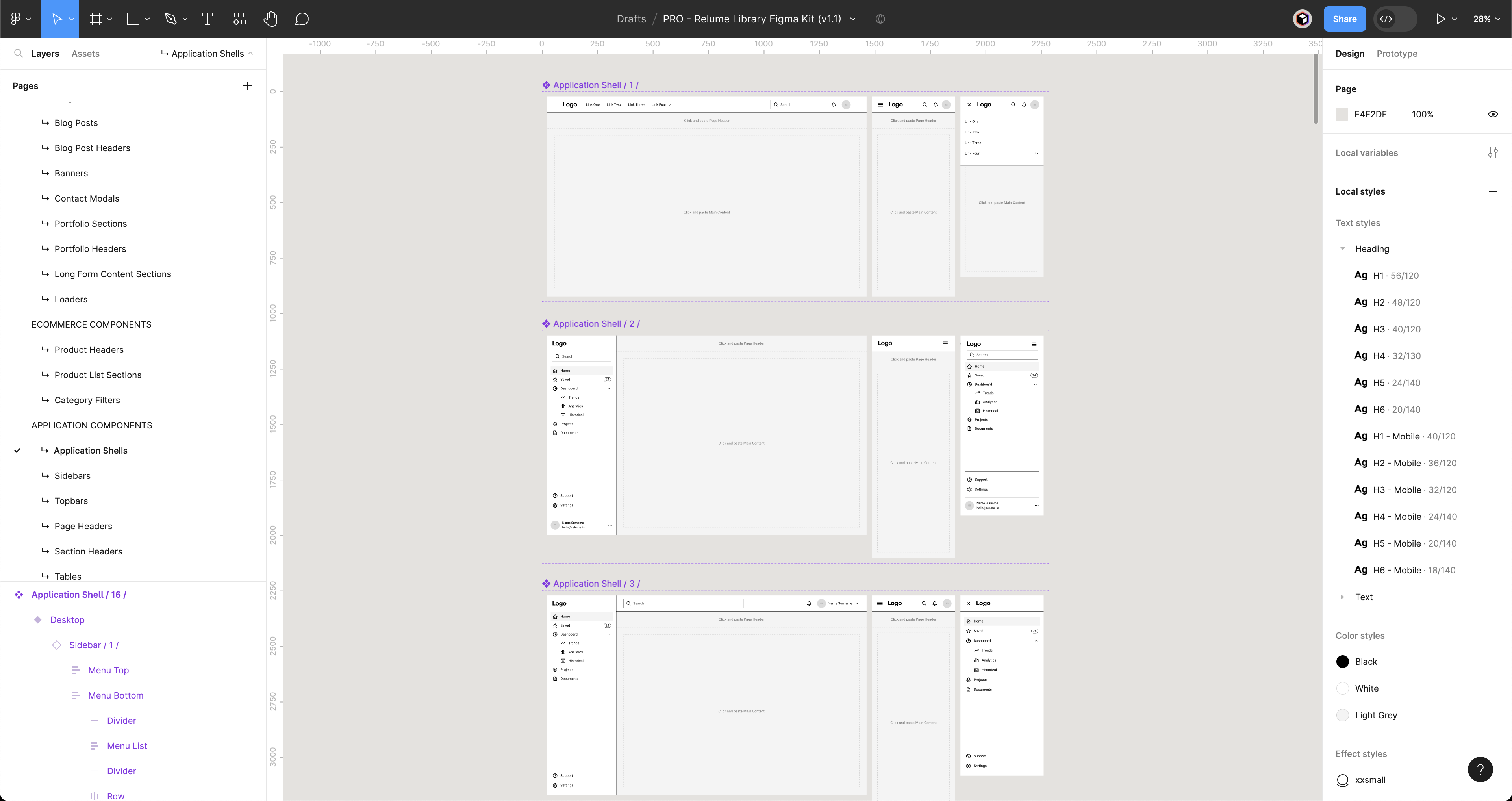
Application Shells
Application Shells are the ideal starting point for your web app. They come pre-built with common layouts, including variations of Topbar and Sidebar layouts that work responsively, as well as a range of different columns for your content.
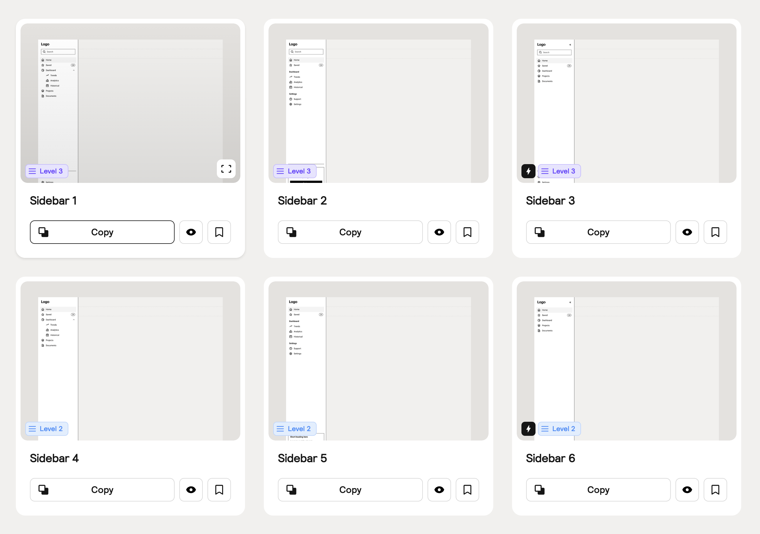
Sidebars
Sidebars provide easy navigation and are particularly useful when there are a large number of links. You can replace the default sidebar navigation in your application shells with one of our other variants, including collapsible sidebars and sidebars with groups.
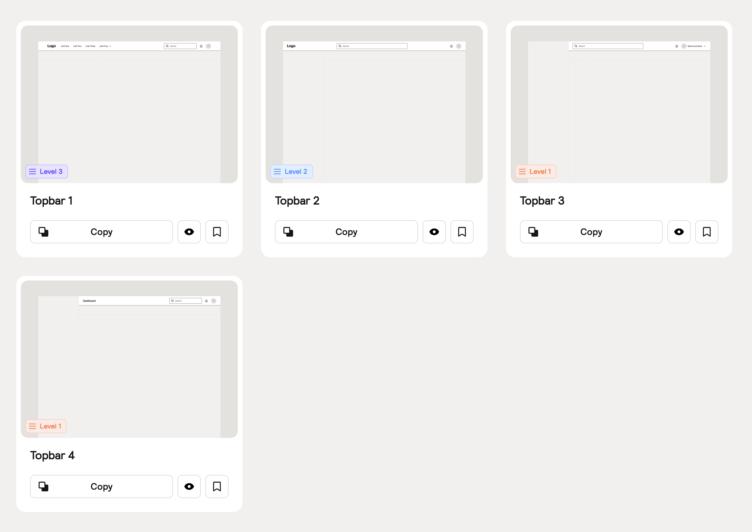
Topbars
Topbars are global navigation elements that run along the top of the user interface. There are four variations of Topbars available that work with various Application Shells.
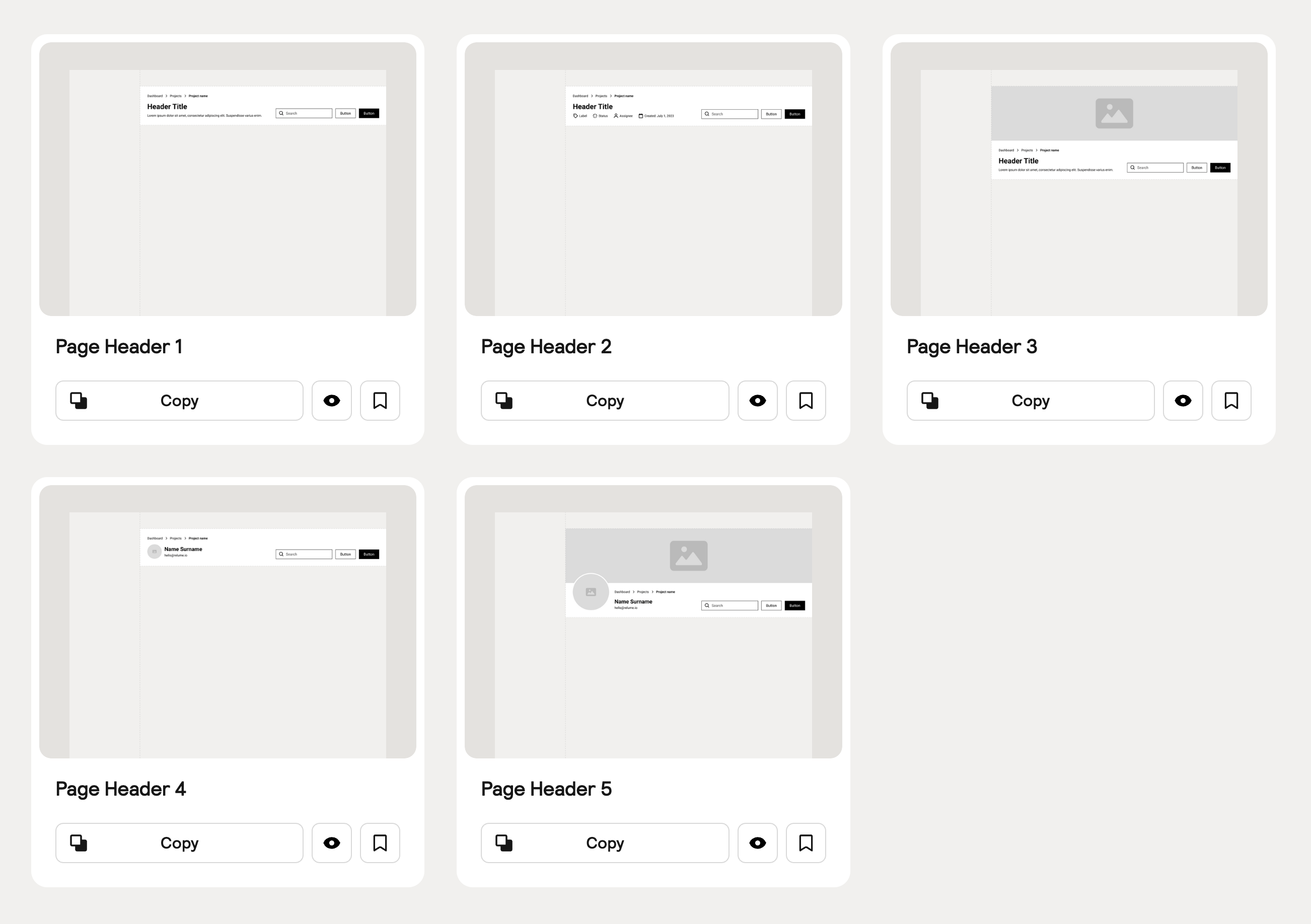
Page Headers
Page Headers provide the title of your app's page and primary actions that users can take on that page. You can add them to your Application Shell in seconds by pasting them into the allocated area and watch them snap perfectly in place.
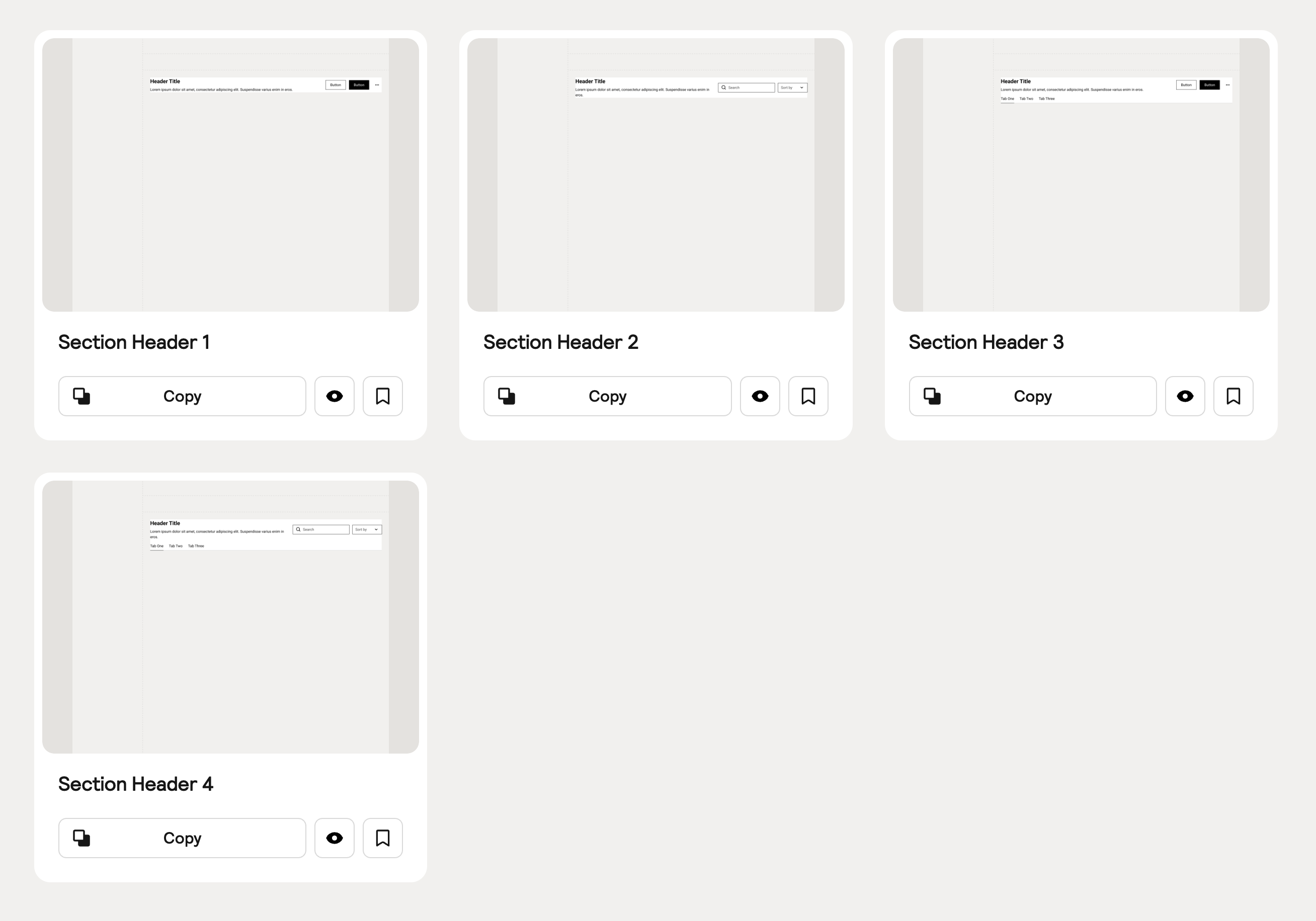
Section Headers
Section Headers introduce sections of your web application with titles and descriptions, as well as providing actions for users to take.
Sitemap Builder Updates
Following the overwhelmingly positive feedback from our last component day, where we introduced our brand new Sitemap Builder, we are excited to ship a few more updates!
Color Tagging
You can now change the color of sections in your sitemaps, which can help you better organize and plan your sites. For example, you can tag sections that you intend to connect to a CMS as purple, or tag sections that you intend to be global components as green.
View-only Sharing
You can now share a view-only link to your sitemap. This makes it easier to share your sitemaps with clients for approval or with other stakeholders.
Figma Pro Update (v1.1)
We have added 38 new application components to our Pro Figma kit, which is available in both desktop and mobile variants. We've also added an open-source icon library, Boxicons, to the style guide. To receive the latest update, visit the Figma Kits in your account.
Note: If you have purchased the Pro Figma kit outside of our Relume library plans you will receive the latest update through Figma or via email depending on where you purchased it.


.webp)

.webp)
.webp)