


.svg)
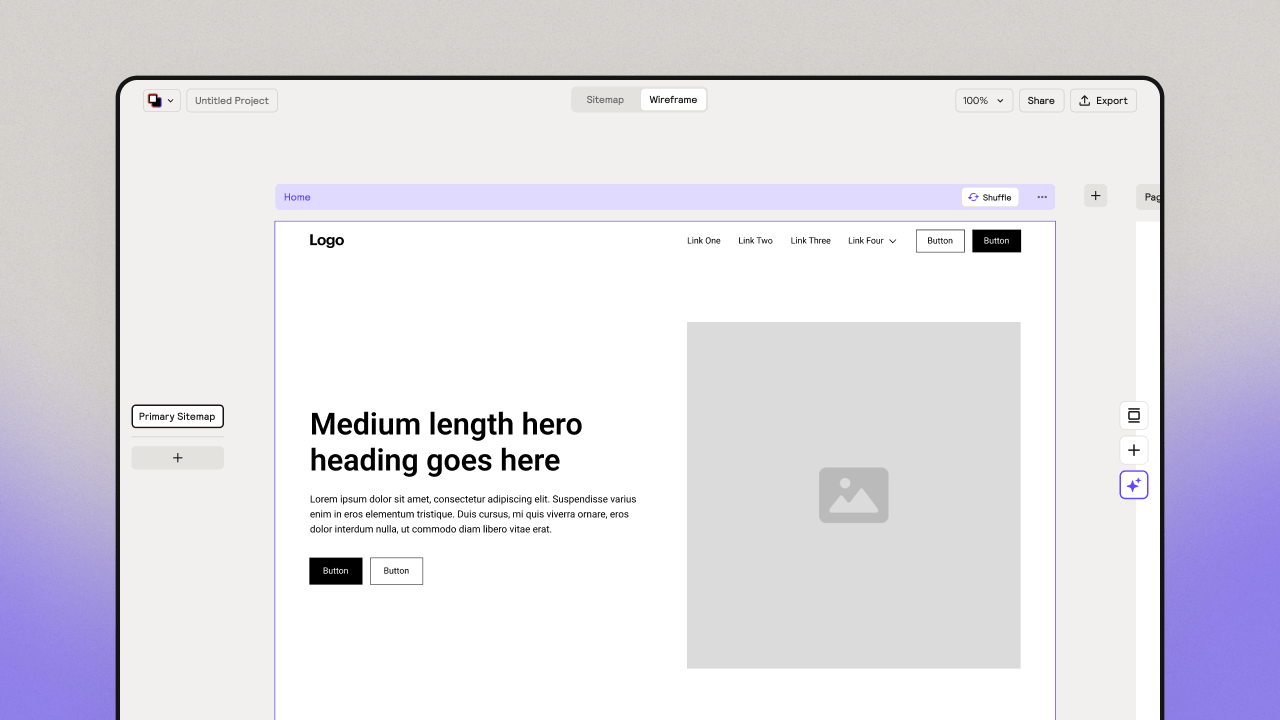
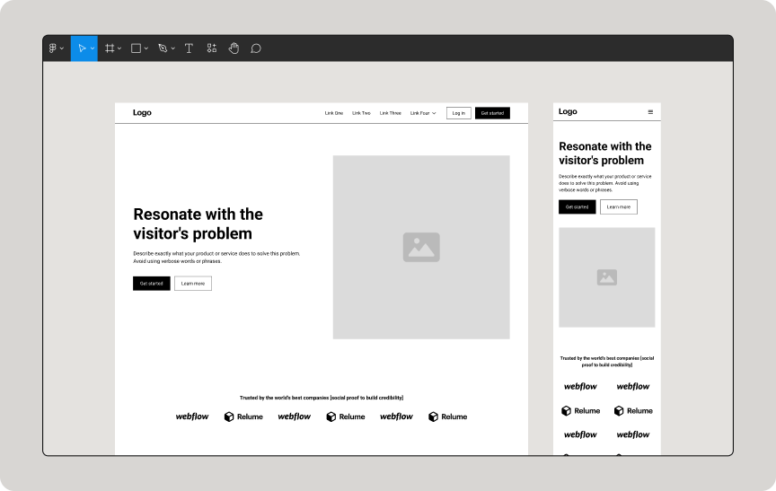
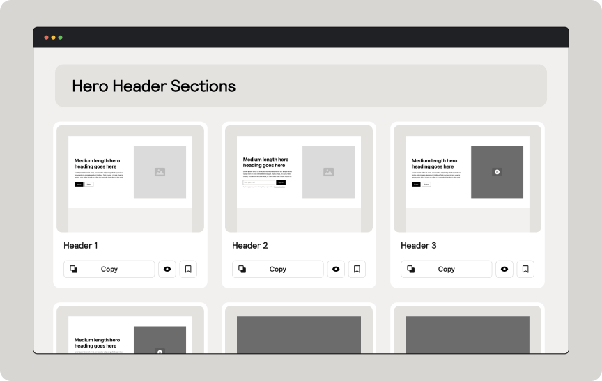
Feature Sections
Install the Relume Chrome Extension for a better workflow
Getting started
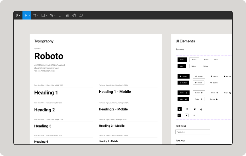
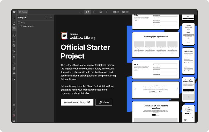
Before you start a project, make sure you clone the Style Guide on Webflow.
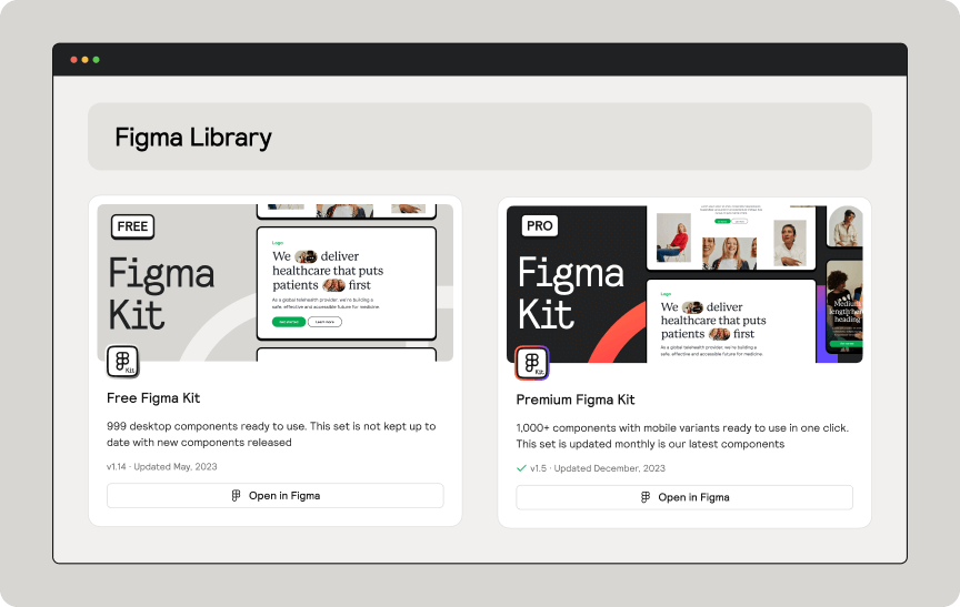
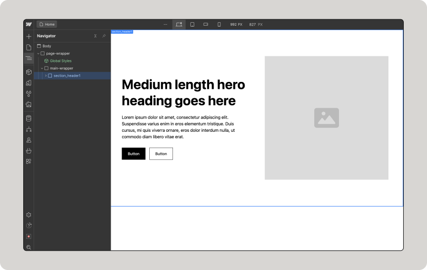
Search the Webflow Library to find components and copy them with 1 click.
Once a component is copied, paste it into your Webflow project.
Dismiss
Sorry, no components found
There are no components with this criteria. Try changing your search.
Request component
Submit requests on Slack
Have any requests or suggestions that would make Relume Library more useful for you? Join our Slack community and share them to the channel #component-requests.


.webp)

.webp)
.webp)