Preferences
Webflow Style Guide
Select the Client-First style guide you are using in your project.
Recommended • The Relume Style Guide is actively managed by the Relume team for easier support. It uses the same pre-built classes as the Finsweet Style Guide, but with different CSS values for spacing and additional elements like shadow and icon classes.
This version of the Relume Style Guide uses Client-First V2.1 which includes the use of color variables, as well as optimizations to utility classes. Learn more
This version of the Relume Style Guide uses Client-First V2.1 which includes the use of color variables, as well as optimizations to utility classes. Learn more

Relume Style Guide - CF V2.1
Recommended
This version of the Relume Style Guide uses Client-First V2 which does not include the use of color variables.

Relume Style Guide - Version 1.5 CF V2
The Finsweet Style Guide uses the same pre-built classes as the Relume Style Guide. It is actively managed by the Finsweet team and is the official style guide for Client-First.
This version of the Finsweet Style Guide uses Client-First V2.1 which includes the use of color variables, as well as optimizations to utility classes. Learn more
This version of the Finsweet Style Guide uses Client-First V2.1 which includes the use of color variables, as well as optimizations to utility classes. Learn more

Finsweet Style Guide - CF V2.1
This version of the Finsweet Style Guide uses Client-First V2 which does not include the use of color variables.

Finsweet Style Guide - CF V2
Webflow Spacing Strategy
Select the spacing strategy you’d like the components to use.
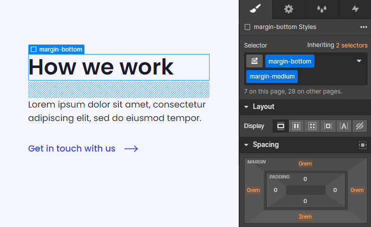
In Client-First, a "spacing wrapper" is a Div Block that wraps a child element and creates space between a sibling element.
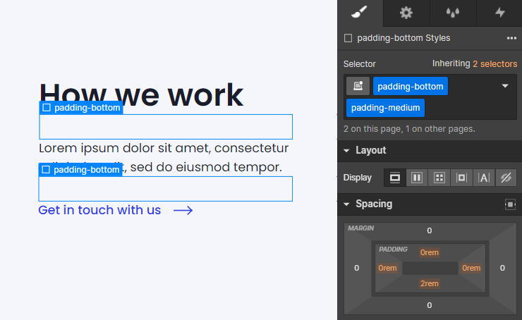
In Client-First, a "spacing block" is an empty Div Block that creates space between two sibling elements.
Clone Style Guide
Team Sections
Layout
Text Alignment
Thank you! Your submission has been received!
Oops! Something went wrong while submitting the form.
Content Alignment
Thank you! Your submission has been received!
Oops! Something went wrong while submitting the form.
Columns
Thank you! Your submission has been received!
Oops! Something went wrong while submitting the form.
Off-grid
An off-grid layout positions primary elements outside the standard grid system. It is designed to offer creative freedom in designs while still maintaining the structure of the Relume design system.
Thank you! Your submission has been received!
Oops! Something went wrong while submitting the form.
Bento
A Bento layout organizes content into a flexible grid, resembling compartments of a Japanese bento box. This layout provides a clean and visually appealing presentation of information.
Thank you! Your submission has been received!
Oops! Something went wrong while submitting the form.
Element
Thank you! Your submission has been received!
Oops! Something went wrong while submitting the form.
Navigation Level
Thank you! Your submission has been received!
Oops! Something went wrong while submitting the form.
More Filters
Interactions
Thank you! Your submission has been received!
Oops! Something went wrong while submitting the form.
Uncommon
Uncommon components use more sophisticated layouts and interactions to take your website to the next level.
Thank you! Your submission has been received!
Oops! Something went wrong while submitting the form.
Clear all
100
Components
Install the Relume Chrome Extension for a better workflow
Getting started
1
Clone Style Guide
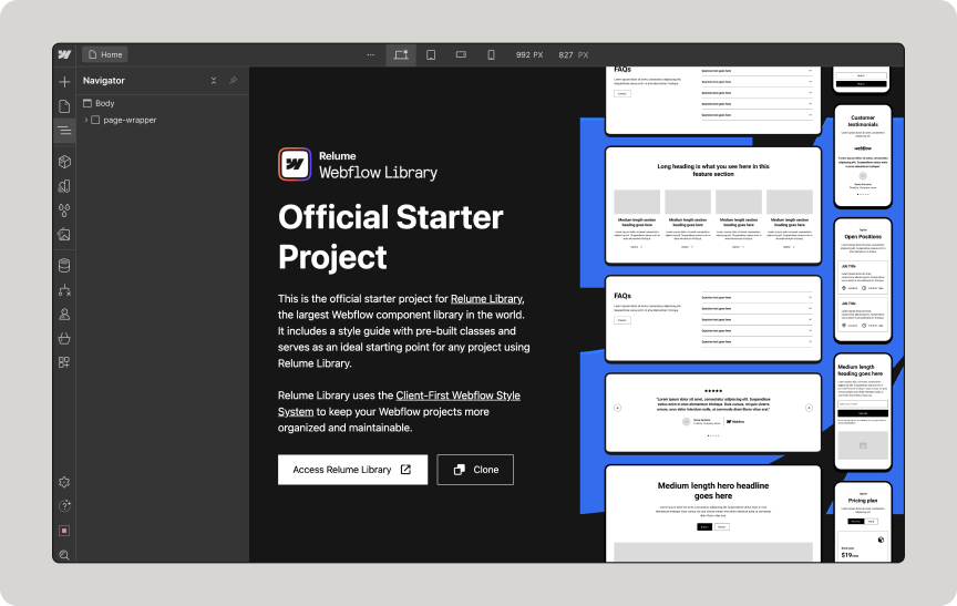
Search the Webflow Library to find components and copy them with 1 click.
2
Copy Component

Once a component is copied, paste it into your Webflow project.
3
Paste into project
Dismiss
Sorry, no components found
There are no components with this criteria. Try changing your search.
Request component


Interactions
Uncommon
Off-grid
Bento
A Level 3 Sidebar or Topbar should be used on its own.
Level 3
A Level 2 Sidebar should be paired with a Level 1 Topbar.
A Level 2 Topbar should be paired with a Level 1 Sidebar.
Level 2
A Level 1 Sidebar should be paired with a Level 2 Topbar.
A Level 1 Topbar should be paired with a Level 2 Sidebar.
Level 1
Uses Attributes
Uses Formly
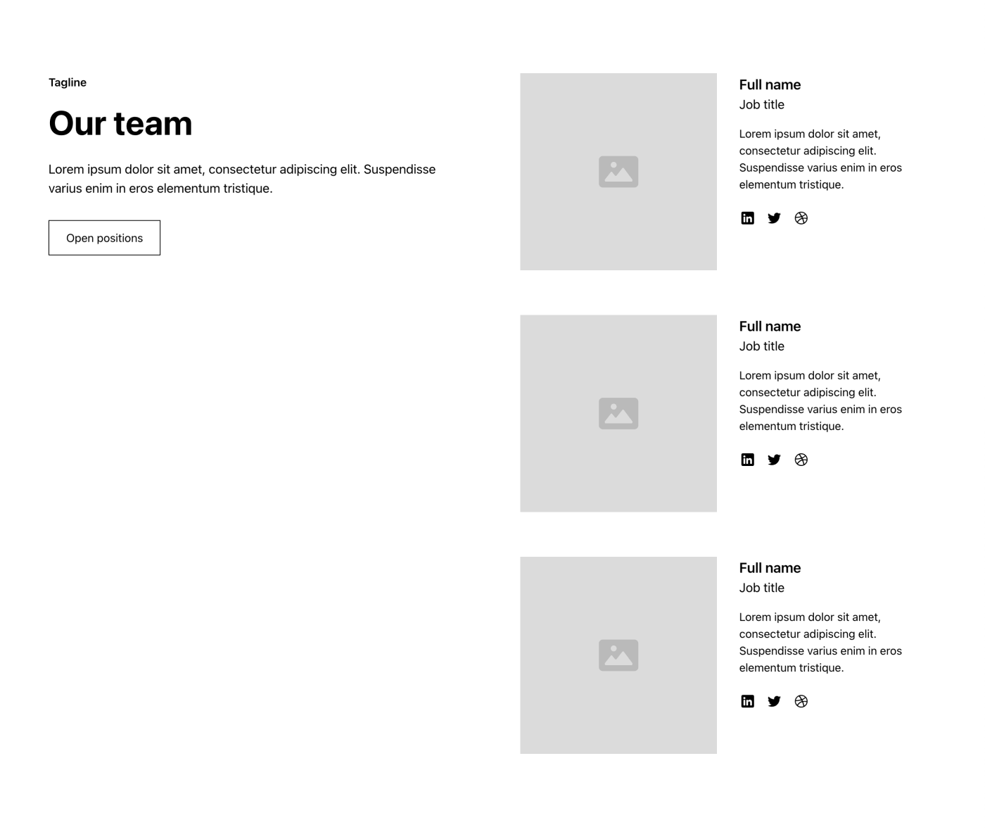
Team 1
.
team-sections/section_team1


Interactions
Uncommon
Off-grid
Bento
A Level 3 Sidebar or Topbar should be used on its own.
Level 3
A Level 2 Sidebar should be paired with a Level 1 Topbar.
A Level 2 Topbar should be paired with a Level 1 Sidebar.
Level 2
A Level 1 Sidebar should be paired with a Level 2 Topbar.
A Level 1 Topbar should be paired with a Level 2 Sidebar.
Level 1
Uses Attributes
Uses Formly
Team 2
.
team-sections/section_team2


Interactions
Uncommon
Off-grid
Bento
A Level 3 Sidebar or Topbar should be used on its own.
Level 3
A Level 2 Sidebar should be paired with a Level 1 Topbar.
A Level 2 Topbar should be paired with a Level 1 Sidebar.
Level 2
A Level 1 Sidebar should be paired with a Level 2 Topbar.
A Level 1 Topbar should be paired with a Level 2 Sidebar.
Level 1
Uses Attributes
Uses Formly
Team 3
.
team-sections/section_team3


Interactions
Uncommon
Off-grid
Bento
A Level 3 Sidebar or Topbar should be used on its own.
Level 3
A Level 2 Sidebar should be paired with a Level 1 Topbar.
A Level 2 Topbar should be paired with a Level 1 Sidebar.
Level 2
A Level 1 Sidebar should be paired with a Level 2 Topbar.
A Level 1 Topbar should be paired with a Level 2 Sidebar.
Level 1
Uses Attributes
Uses Formly
Team 4
.
team-sections/section_team4


Interactions
Uncommon
Off-grid
Bento
A Level 3 Sidebar or Topbar should be used on its own.
Level 3
A Level 2 Sidebar should be paired with a Level 1 Topbar.
A Level 2 Topbar should be paired with a Level 1 Sidebar.
Level 2
A Level 1 Sidebar should be paired with a Level 2 Topbar.
A Level 1 Topbar should be paired with a Level 2 Sidebar.
Level 1
Uses Attributes
Uses Formly
Team 5
.
team-sections/section_team5


Interactions
Uncommon
Off-grid
Bento
A Level 3 Sidebar or Topbar should be used on its own.
Level 3
A Level 2 Sidebar should be paired with a Level 1 Topbar.
A Level 2 Topbar should be paired with a Level 1 Sidebar.
Level 2
A Level 1 Sidebar should be paired with a Level 2 Topbar.
A Level 1 Topbar should be paired with a Level 2 Sidebar.
Level 1
Uses Attributes
Uses Formly
Team 6
.
team-sections/section_team6


Interactions
Uncommon
Off-grid
Bento
A Level 3 Sidebar or Topbar should be used on its own.
Level 3
A Level 2 Sidebar should be paired with a Level 1 Topbar.
A Level 2 Topbar should be paired with a Level 1 Sidebar.
Level 2
A Level 1 Sidebar should be paired with a Level 2 Topbar.
A Level 1 Topbar should be paired with a Level 2 Sidebar.
Level 1
Uses Attributes
Uses Formly
Team 7
.
team-sections/section_team7


Interactions
Uncommon
Off-grid
Bento
A Level 3 Sidebar or Topbar should be used on its own.
Level 3
A Level 2 Sidebar should be paired with a Level 1 Topbar.
A Level 2 Topbar should be paired with a Level 1 Sidebar.
Level 2
A Level 1 Sidebar should be paired with a Level 2 Topbar.
A Level 1 Topbar should be paired with a Level 2 Sidebar.
Level 1
Uses Attributes
Uses Formly
Team 8
.
team-sections/section_team8


Interactions
Uncommon
Off-grid
Bento
A Level 3 Sidebar or Topbar should be used on its own.
Level 3
A Level 2 Sidebar should be paired with a Level 1 Topbar.
A Level 2 Topbar should be paired with a Level 1 Sidebar.
Level 2
A Level 1 Sidebar should be paired with a Level 2 Topbar.
A Level 1 Topbar should be paired with a Level 2 Sidebar.
Level 1
Uses Attributes
Uses Formly
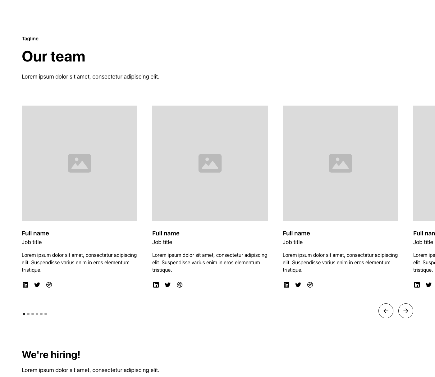
Team 9
.
team-sections/section_team9


Interactions
Uncommon
Off-grid
Bento
A Level 3 Sidebar or Topbar should be used on its own.
Level 3
A Level 2 Sidebar should be paired with a Level 1 Topbar.
A Level 2 Topbar should be paired with a Level 1 Sidebar.
Level 2
A Level 1 Sidebar should be paired with a Level 2 Topbar.
A Level 1 Topbar should be paired with a Level 2 Sidebar.
Level 1
Uses Attributes
Uses Formly
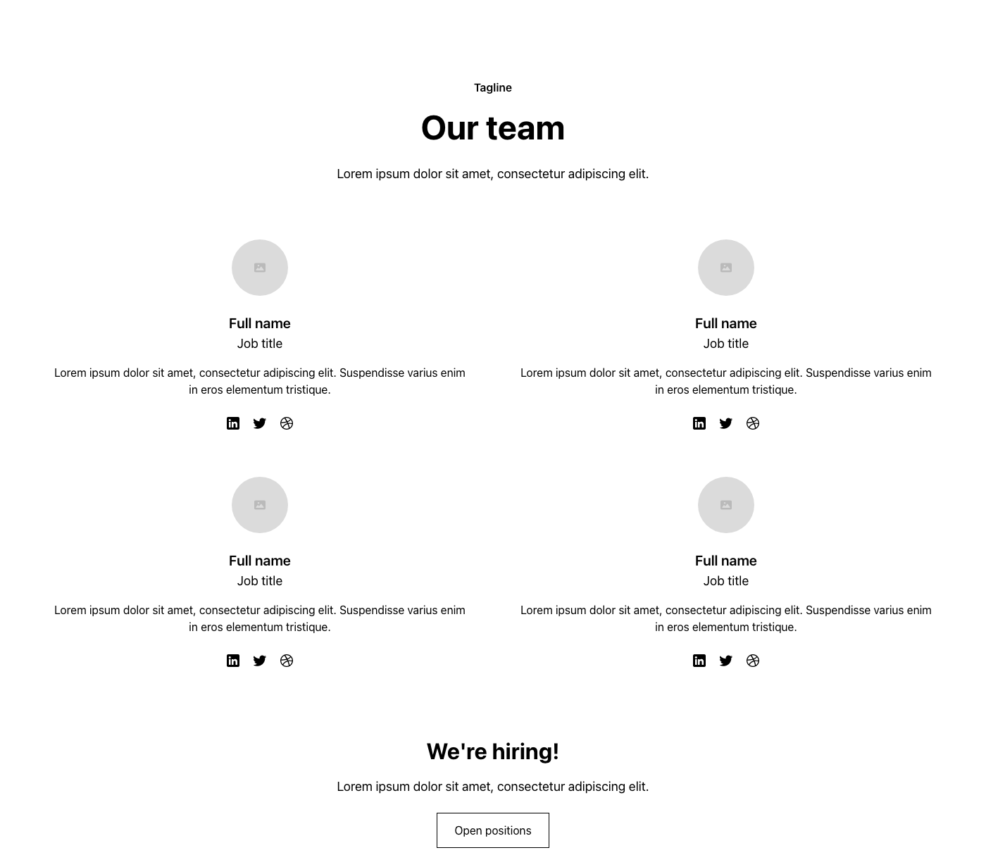
Team 10
.
team-sections/section_team10


Interactions
Uncommon
Off-grid
Bento
A Level 3 Sidebar or Topbar should be used on its own.
Level 3
A Level 2 Sidebar should be paired with a Level 1 Topbar.
A Level 2 Topbar should be paired with a Level 1 Sidebar.
Level 2
A Level 1 Sidebar should be paired with a Level 2 Topbar.
A Level 1 Topbar should be paired with a Level 2 Sidebar.
Level 1
Uses Attributes
Uses Formly
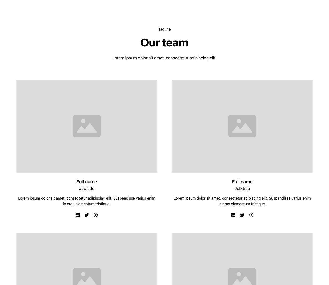
Team 11
.
team-sections/section_team11


Interactions
Uncommon
Off-grid
Bento
A Level 3 Sidebar or Topbar should be used on its own.
Level 3
A Level 2 Sidebar should be paired with a Level 1 Topbar.
A Level 2 Topbar should be paired with a Level 1 Sidebar.
Level 2
A Level 1 Sidebar should be paired with a Level 2 Topbar.
A Level 1 Topbar should be paired with a Level 2 Sidebar.
Level 1
Uses Attributes
Uses Formly
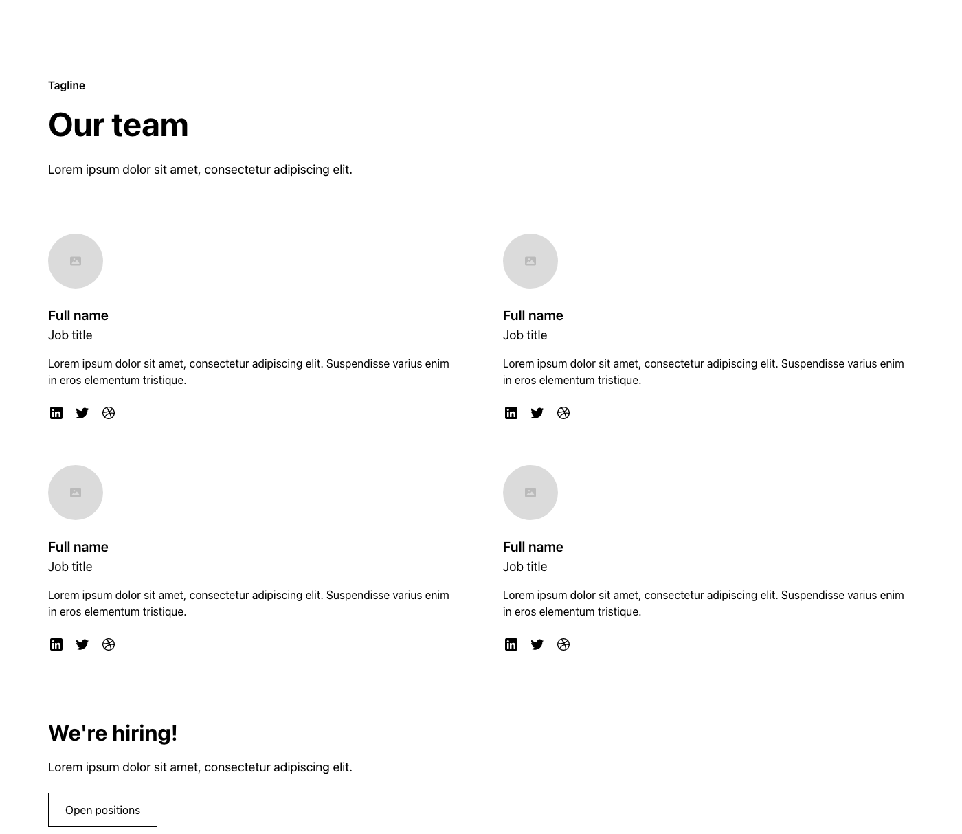
Team 12
.
team-sections/section_team12


Interactions
Uncommon
Off-grid
Bento
A Level 3 Sidebar or Topbar should be used on its own.
Level 3
A Level 2 Sidebar should be paired with a Level 1 Topbar.
A Level 2 Topbar should be paired with a Level 1 Sidebar.
Level 2
A Level 1 Sidebar should be paired with a Level 2 Topbar.
A Level 1 Topbar should be paired with a Level 2 Sidebar.
Level 1
Uses Attributes
Uses Formly
Team 13
.
team-sections/section_team13
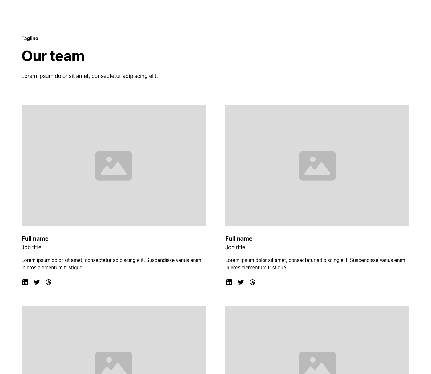


Interactions
Uncommon
Off-grid
Bento
A Level 3 Sidebar or Topbar should be used on its own.
Level 3
A Level 2 Sidebar should be paired with a Level 1 Topbar.
A Level 2 Topbar should be paired with a Level 1 Sidebar.
Level 2
A Level 1 Sidebar should be paired with a Level 2 Topbar.
A Level 1 Topbar should be paired with a Level 2 Sidebar.
Level 1
Uses Attributes
Uses Formly
Team 14
.
team-sections/section_team14
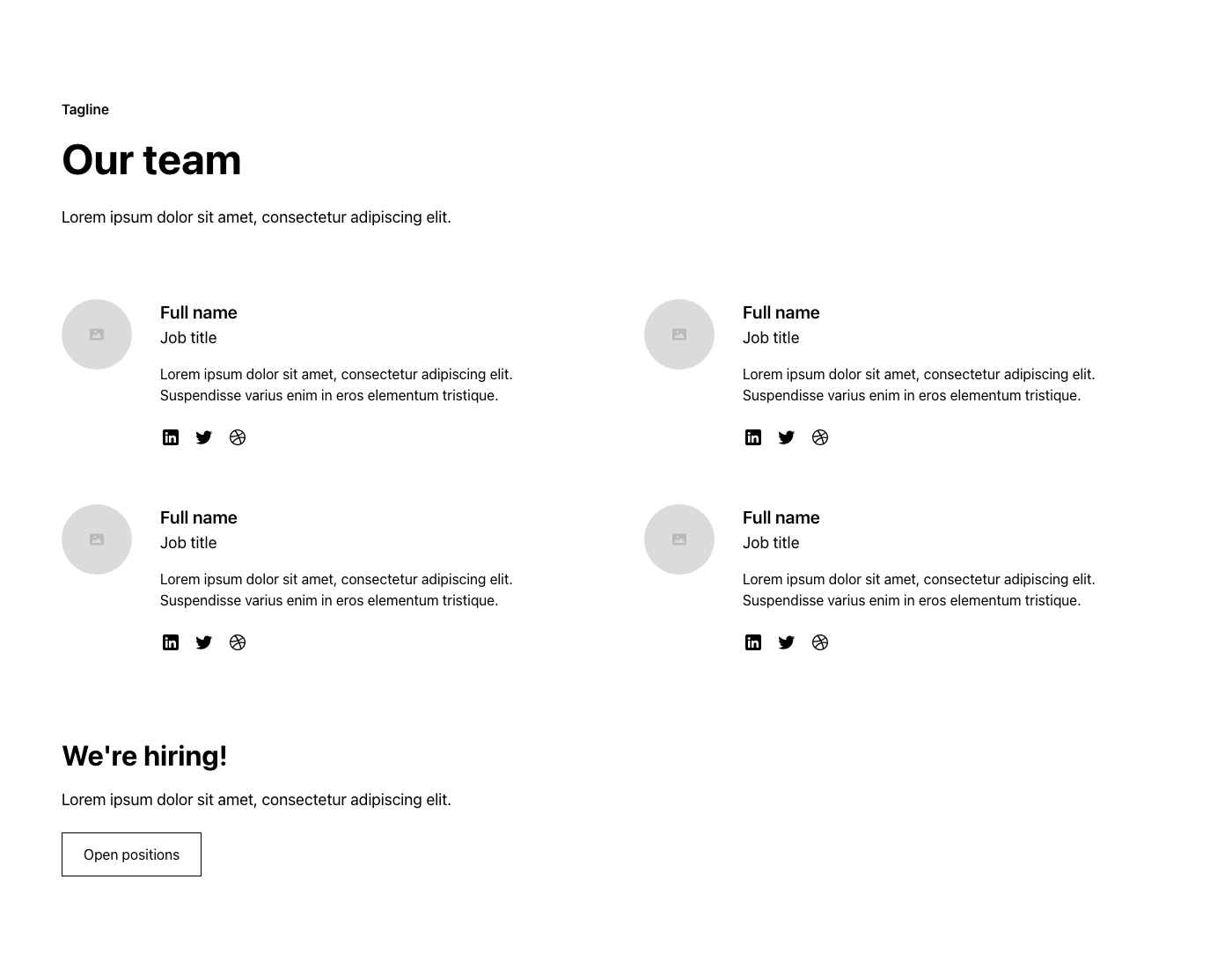


Interactions
Uncommon
Off-grid
Bento
A Level 3 Sidebar or Topbar should be used on its own.
Level 3
A Level 2 Sidebar should be paired with a Level 1 Topbar.
A Level 2 Topbar should be paired with a Level 1 Sidebar.
Level 2
A Level 1 Sidebar should be paired with a Level 2 Topbar.
A Level 1 Topbar should be paired with a Level 2 Sidebar.
Level 1
Uses Attributes
Uses Formly
Team 15
.
team-sections/section_team15
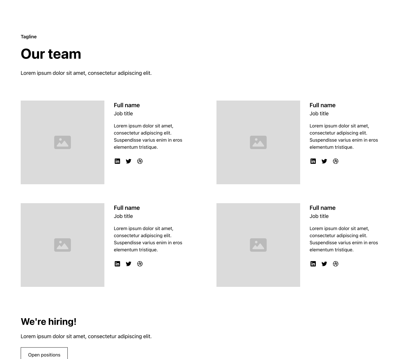


Interactions
Uncommon
Off-grid
Bento
A Level 3 Sidebar or Topbar should be used on its own.
Level 3
A Level 2 Sidebar should be paired with a Level 1 Topbar.
A Level 2 Topbar should be paired with a Level 1 Sidebar.
Level 2
A Level 1 Sidebar should be paired with a Level 2 Topbar.
A Level 1 Topbar should be paired with a Level 2 Sidebar.
Level 1
Uses Attributes
Uses Formly
Team 16
.
team-sections/section_team16
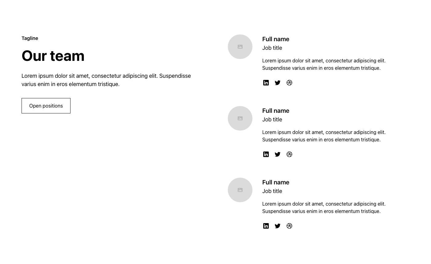


Interactions
Uncommon
Off-grid
Bento
A Level 3 Sidebar or Topbar should be used on its own.
Level 3
A Level 2 Sidebar should be paired with a Level 1 Topbar.
A Level 2 Topbar should be paired with a Level 1 Sidebar.
Level 2
A Level 1 Sidebar should be paired with a Level 2 Topbar.
A Level 1 Topbar should be paired with a Level 2 Sidebar.
Level 1
Uses Attributes
Uses Formly
Team 17
.
team-sections/section_team17


Interactions
Uncommon
Off-grid
Bento
A Level 3 Sidebar or Topbar should be used on its own.
Level 3
A Level 2 Sidebar should be paired with a Level 1 Topbar.
A Level 2 Topbar should be paired with a Level 1 Sidebar.
Level 2
A Level 1 Sidebar should be paired with a Level 2 Topbar.
A Level 1 Topbar should be paired with a Level 2 Sidebar.
Level 1
Uses Attributes
Uses Formly
Team 18
.
team-sections/section_team18


Interactions
Uncommon
Off-grid
Bento
A Level 3 Sidebar or Topbar should be used on its own.
Level 3
A Level 2 Sidebar should be paired with a Level 1 Topbar.
A Level 2 Topbar should be paired with a Level 1 Sidebar.
Level 2
A Level 1 Sidebar should be paired with a Level 2 Topbar.
A Level 1 Topbar should be paired with a Level 2 Sidebar.
Level 1
Uses Attributes
Uses Formly
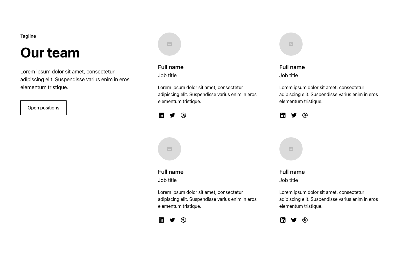
Team 19
.
team-sections/section_team19


Interactions
Uncommon
Off-grid
Bento
A Level 3 Sidebar or Topbar should be used on its own.
Level 3
A Level 2 Sidebar should be paired with a Level 1 Topbar.
A Level 2 Topbar should be paired with a Level 1 Sidebar.
Level 2
A Level 1 Sidebar should be paired with a Level 2 Topbar.
A Level 1 Topbar should be paired with a Level 2 Sidebar.
Level 1
Uses Attributes
Uses Formly
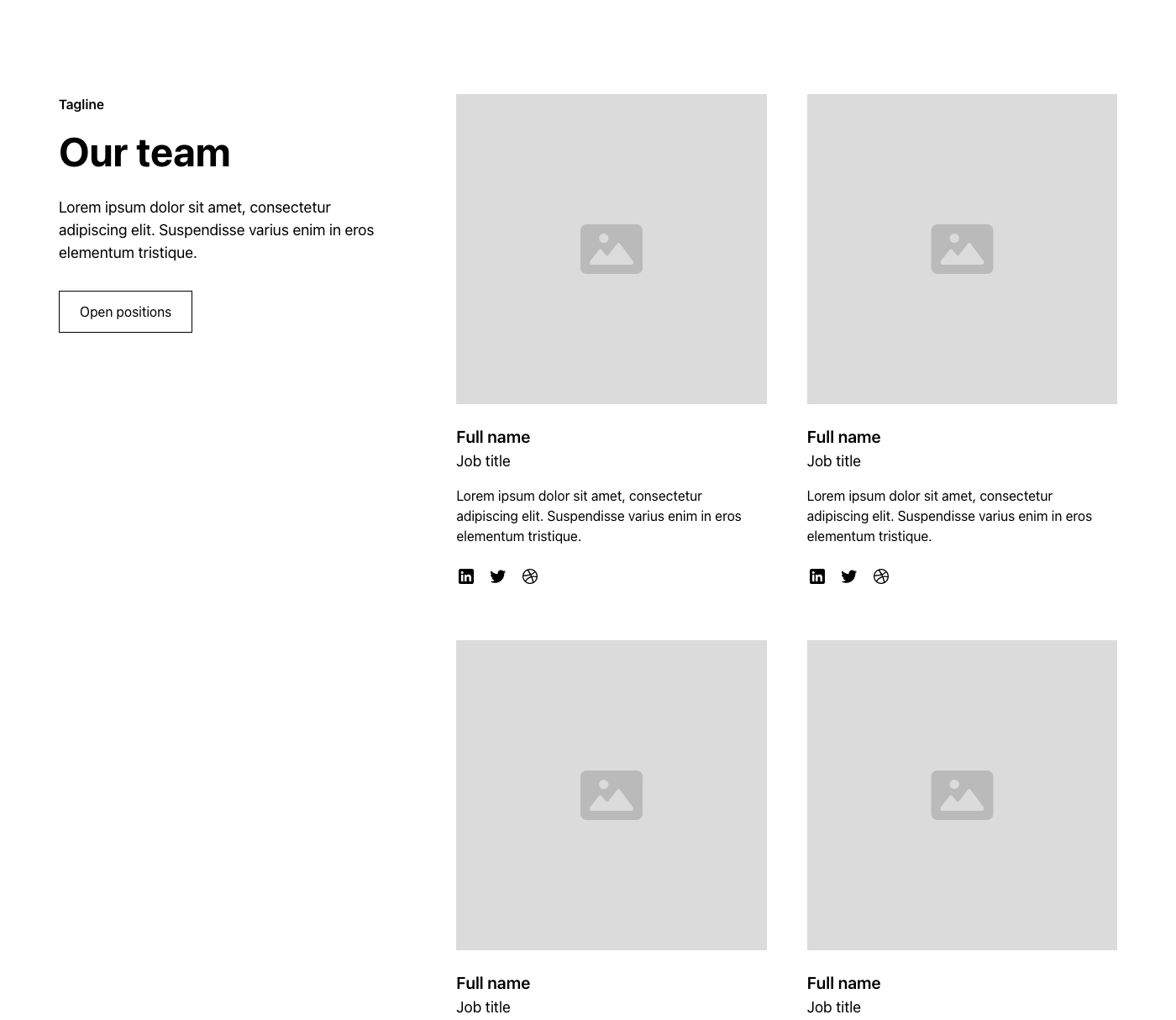
Team 20
.
team-sections/section_team20


Interactions
Uncommon
Off-grid
Bento
A Level 3 Sidebar or Topbar should be used on its own.
Level 3
A Level 2 Sidebar should be paired with a Level 1 Topbar.
A Level 2 Topbar should be paired with a Level 1 Sidebar.
Level 2
A Level 1 Sidebar should be paired with a Level 2 Topbar.
A Level 1 Topbar should be paired with a Level 2 Sidebar.
Level 1
Uses Attributes
Uses Formly
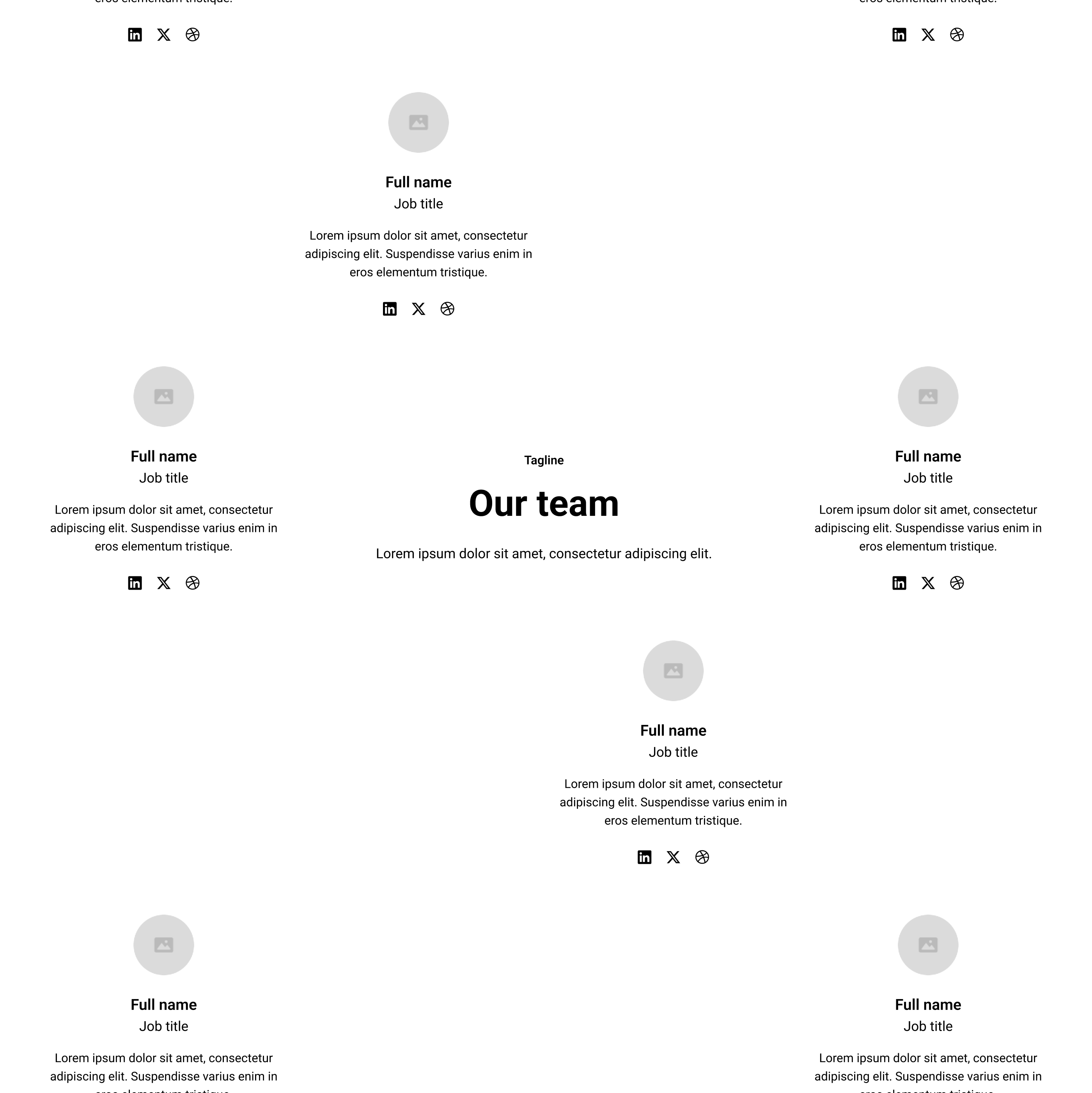
Team 21
.
uncommon-components-2/section_team21
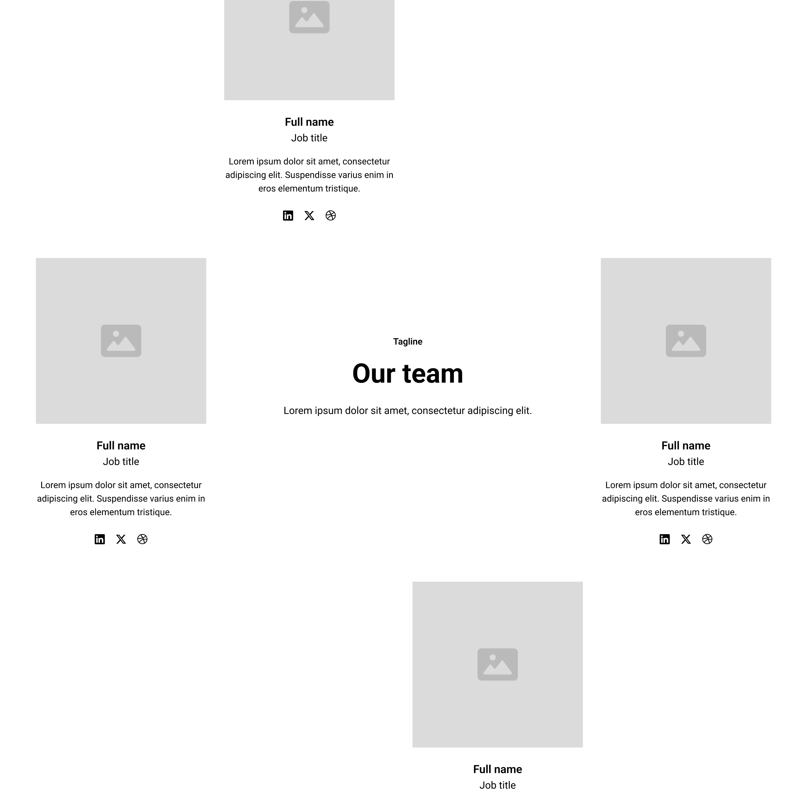


Interactions
Uncommon
Off-grid
Bento
A Level 3 Sidebar or Topbar should be used on its own.
Level 3
A Level 2 Sidebar should be paired with a Level 1 Topbar.
A Level 2 Topbar should be paired with a Level 1 Sidebar.
Level 2
A Level 1 Sidebar should be paired with a Level 2 Topbar.
A Level 1 Topbar should be paired with a Level 2 Sidebar.
Level 1
Uses Attributes
Uses Formly
Team 22
.
uncommon-components-2/section_team22



.png)









.webp)

.webp)
.webp)


